Today my ignorance is going to swallow me whole.
I decided to play with more fonts again, and switched the title and author name to "Budoni 72 Smallcaps". I kind of like the title like that, but I'm trying to decide if it's worth it to switch the author name into small caps. I'll think more about that later.
Anyhow, I exported it as a pdf, like I always do with the spread. But I noticed the colors were not as vibrant.
Here's what it looks like:
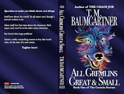
And I know nothing about different color spaces, but I suspected this was a CMYK vs RGB thing — so I changed the export to RGB and got this.
That's a huge difference.
Google tells me that RGB is used for on-screen images, and CMYK is used for printing devices and that it's hard to achieve the same brightness with ink on paper.
So I learned something new today. I don't think there's really much I can do about it, and I guess the CMYK is okay, but I suspect a real cover designer would have thought about this earlier in the process.
2 comments:
I didn't know that about achieving the same brightness off a press. I know it's hard to achieve a really dark color. Long ago, I had a printer almost end me when I showed him the mostly black cover a graphic designer created for a magazine. It may no longer be an issue now that everything is digital. It sounds like you already know the resolution of the images makes a difference, with 300 needed for the press, slightly lower if it's coming off a high quality printer and 72 for electronic presentation.
Ha! From complaints I've heard on author groups, black is still an issue with print covers as new people find out why a black background on a cover is a bad idea.
For the ebook covers, I just make sure the final jpeg is somewhere near 2560 x 1600 pixels, which is what KDP wants. Since I design for a 5x8" paperback, when I export the front cover jpeg, that means I need to tell it to use over 300 pixels per inch. I guess they want it to look pretty on all the devices. (But I definitely make a smaller version for my website, because nobody wants to wait for ten gigantic covers to load.)
Post a Comment