More work on the reader magnet cover, which should fit in with these covers.
Yesterday, I got to this point.

Today I wanted to start on the typography. First stop: figure out what font to use. There's a website (https://www.myfonts.com/WhatTheFont/) where you can upload an image and it will give you a list of fonts that are close. I did that, and it did indeed give me a list of fonts, but none of them were part of the Adobe suite. I could have purchased a new font, but I was pretty sure Adobe already had one licensed that I could use. It took me some time, but I eventually found "Industry".
So I plugged that into my standard template, messed around with embossing, and got this:
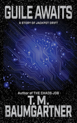
First, this is easily 100% better than the cover I have been using for my reader magnet up to now. Having said that, I need to change some obvious things.
- The title needs to take up more space.
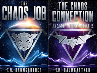
- The series name needs to be bigger (to match how it is on The Chaos Connection).
- I need to make the author name smaller to match. (In my usual template, the author name is at the top of the book and the title at the bottom. Since I'm not following my usual branding with this anyhow, I might as well make it look as close to the series as possible.)
No comments:
Post a Comment