It's typography day!
There are many things that still need to get fixed in the image, but what the heck, why not move on to typography for a while? (The good news is I can swap out the image in InDesign really easily, so this work isn't wasted because I need to go back and do other image stuff.)
Fonts are always a challenge because I really have no idea what I'm doing. So generally I end up using the same font for all my designs in a single genre — I have a cozy font, a fantasy font, and a SF font.
(Most of the books I've released up to now have been either pre-mades or custom covers. I think Death Trims the Tree is the first one I did on my own. But I've done other covers for short stories.)
Anyhow, I threw the latest picture into InDesign and set it up with my SF font (Arial), made everything fit where it needed to fit, and saved a copy.
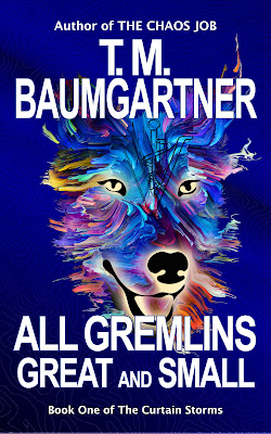
Honestly, I think this is a good start. (Blogger makes it look blurrier than it would normally look.)
First thoughts on what isn't right:
- I think the dog's head could be a tad smaller (though I'm on the fence about that).
- The spacing in the title is wonky, especially around "AND". I'm also not wild about that font for the title.
- There's too much space between the title and the series name.
But overall, I would not be completely embarrassed to use this.
One thing to check in this age of ebooks is how the thumbnail looks.
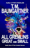
I can read the author's name and even the title, so that's actually pretty good.
So let me switch to my go-to fantasy font (Minion Pro) for the title and see what happens...
So... Maybe? I'm not convinced.
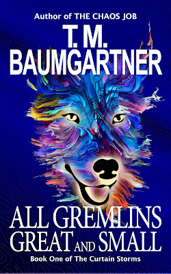
At this point it occurred to me that using an ampersand in place of "AND" might be the way to go. Then I had an attack of "Can I do that?", because the retailers are really picky about the title matching what's on the cover. I think it should be okay, since different versions of the James Herriot novels have them with and without the ampersand, but I may have to do more research. Anyhow, this is what it looks like.

I think the ampersand is an improvement. Still not sure about the fonts (which is the story of my life), but at least this is a starting point. I'll mess around with it more tomorrow.
No comments:
Post a Comment