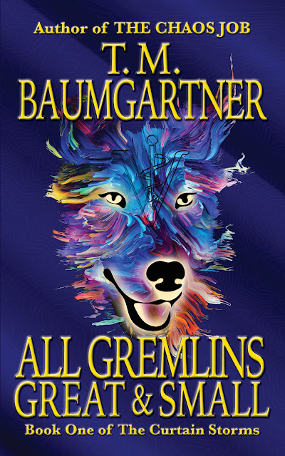
In my quest to make the title more legible, I used a lighter gold (aka, yellow). I'm tempted to say the gold makes it look more classy, but I'm not sure "classy" is what I'm aiming for. I sort of like this text color.
I also switched the top and bottom lines to be embossed instead of beveled, which makes them a little more legible. (I bumped up the size as well, but I think most of the legibility gain is because they aren't fading into black.)
Then I started playing with a bunch of the other options, which was fun, but not really that useful for this project.
Anyhow, this is where it is at the moment. I may switch back to one of the other fonts, but I'd be willing to go with this as is.
(I should probably finish writing this dang book...)
No comments:
Post a Comment