Monday, February 28, 2022

Cover Art (Day 28)

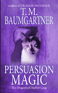
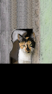
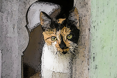
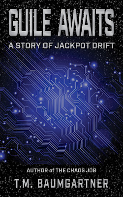
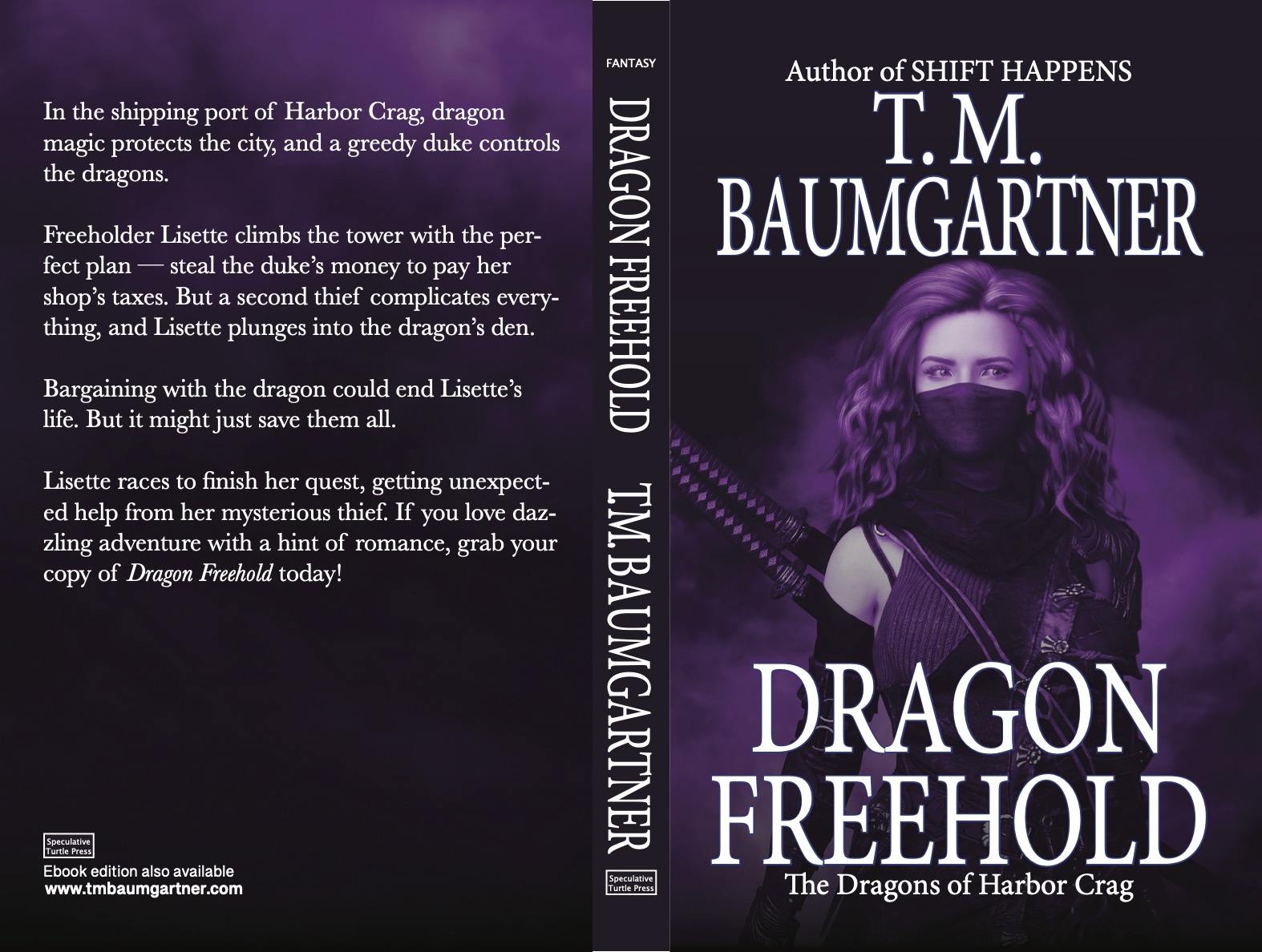
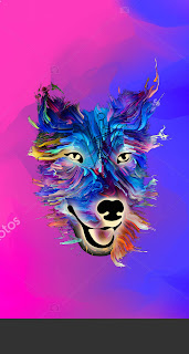
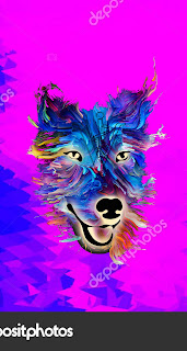
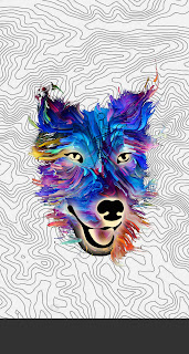
 So I ended up yesterday with a cover that was... okay, but kind of boring. Plus, I wasn't sure it really conveyed the story is a fantasy.

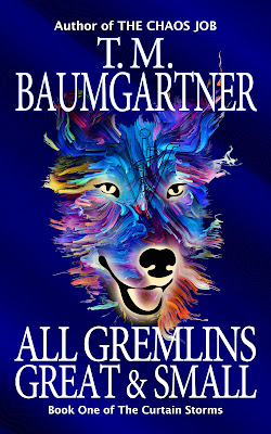
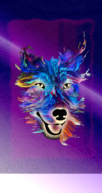
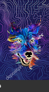
What I wanted was magic. Do I know how to make something magical? Absolutely not. But I figured swirls and sparkles might work. So I added some lines, pinch & swirl, and then a little Gaussian blur to make it all blend in. Then I went back and added some white points. (I'd planned to have those sparkle, but I couldn't get the sparkle effect to work the way I wanted it to.)

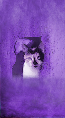
Anyhow, I ended up with this:


It adds a little energy, but it does look a little hokey. Still... I think it might be worth making another pass at it to see if I can make it work.

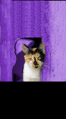
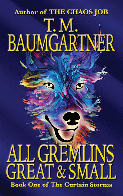
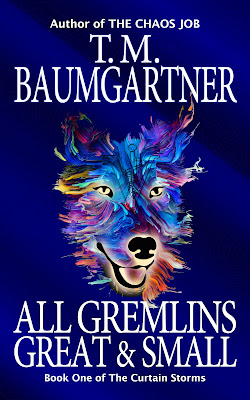
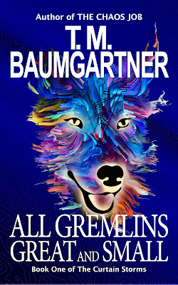
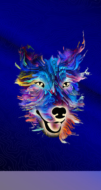
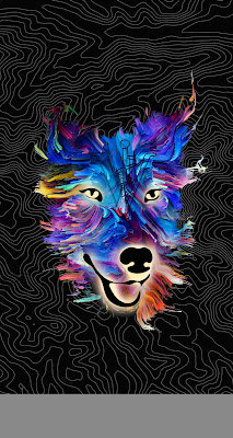
Anyhow, I went ahead and used it for the cover background, which gives this:


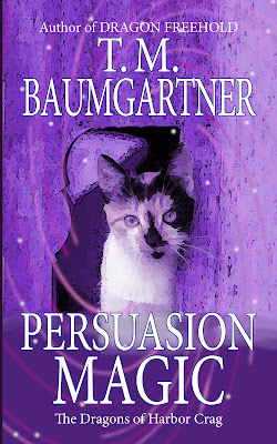
I don't know... It doesn't look quite as hokey, though maybe I should have the swirls stand out more. I don't know. My art sense is pretty severely impaired, so doing my own art is probably a mistake from the start.

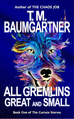
Then I added embossing, because that's my new favorite thing.


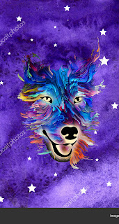
I mean... I've seen worse covers. And it definitely brings in the magic aspect. Maybe my standards are low, but I'd consider using this. (Uh... that means I probably will use this.) This cover is growing on me.

Anyhow, that's the end of Thingadailies! We will now return to our irregularly scheduled random content.


Sunday, February 27, 2022

Cover Art (Day 27)

 By trial and error, I've made the wiped out the bottom black part and added some smoke/fog. (I thought the smoke/fog would help make it more like the other cover. Do I know what I'm doing? Absolutely not!)

This is where it's at


I may want make the edges darker, but I think this will be a start. (It's easy to swap out the image in InDesign, so I can always make changes later.)

The next hurdle was the text. Not where to place it, but what to put there — I haven't named this story yet. I also haven't written the story yet. So... I came up with a title (Persuasion Magic) that could very well change later. I think that can be said for every single part of this cover. Total commitment, that's me!


It does look more like a cover with the writing on it. I'm not convinced it says "fantasy", though. If I new how to add magical swirls, that might help.

Googling "magical swirls" ought to be a lot of fun...

Saturday, February 26, 2022

Cover Art (Day 26)

As a reminder, I'm currently noodling around with the cover for a reader magnet that goes along with this book:


Yesterday I found a picture of a calico cat and messed around with it a bit to get it to look more like an illustration than a photo.

Then I worked on adding some height to the photo, since I'm going to need something to put the text on.

Clearly I just copied some sections and stacked them. Part of that will be blocked out to make the text stand out, so I'm not too worried about it.

The color palette is all wrong, so I made some changes...

So... it's getting closer to what I want. Yes, I still need to deal with the big black space at the bottom, and maybe try to get the layers to blend a little better. (Ha! I have no idea how to start with that...)

Anyhow, I'm having fun, and I think this is going in a direction I want, so I'll keep messing with it tomorrow.


Friday, February 25, 2022

Cover Art (Day 25)

Four days left of Thingadailies (though I seem to be the only participant still standing, and I think I gave up on the rules a while back...).

I made a list of five possible newsletter magnets that I could write to bring people into various other books. One of those is to go along with Dragon Freehold (available now!). The story I'm going to write takes place before the events of the book, when the main character meets his cat.

I went on over to DepositPhotos to look for an image. You may be surprised to know that "man calico mystery" and various similar search terms don't return anything helpful. (And honestly, that's a travesty — everyone knows hot guys are even hotter when they have a cat. There are whole calendars based around this.)

So my choice is to either go with a cat or go with a guy. I'm starting with a cat. I may change my mind.

Here's my starting point:


Pros: She's a calico, and she's adorable.

Cons: This is clearly a photo (which is not what people use on fantasy books), and instead of being vertically oriented, it's horizontal.

The vertical/horizontal problem I can get around by adding some space at the top and bottom and fading out — I'd need some space there anyhow for the title and author name. So we'll just assume that's solvable.

Dealing with the photo... I'm positive this would be a matter of minutes for someone who knew what they were doing, but I don't think I can even pretend anymore. I started with the "cartoon" filter in GIMP and couldn't really tell the difference. So I went to the "waterpixels" and got this.


Then I tried the cartoon again, and ended up with this

I don't know if this is going in a useful direction, but I think I'll start with this and see if I can extend the image to more of a book form tomorrow...


Thursday, February 24, 2022

Cover Art (Day 24)

Okay, so I did most of the changes I talked about yesterday. At this point, 


This is what the covers look like together:


The typography is definitely not right, but it's close. Well... close-ish. I think it looks like it belongs in the same series, even if it clearly wasn't designed by the same team.

I could probably mess around with it forever, but I think I've hit the point of diminishing returns, so I'm going to say "tada!" and call it done.

Again, this is a million times better than the cover I've currently got on the story.

Wednesday, February 23, 2022

Cover Art (Day 23)

More work on the reader magnet cover, which should fit in with these covers.


Yesterday, I got to this point.


Today I wanted to start on the typography. First stop: figure out what font to use. There's a website (https://www.myfonts.com/WhatTheFont/) where you can upload an image and it will give you a list of fonts that are close. I did that, and it did indeed give me a list of fonts, but none of them were part of the Adobe suite. I could have purchased a new font, but I was pretty sure Adobe already had one licensed that I could use. It took me some time, but I eventually found "Industry".

So I plugged that into my standard template, messed around with embossing, and got this:


First, this is easily 100% better than the cover I have been using for my reader magnet up to now. Having said that, I need to change some obvious things.

  • The title needs to take up more space.
  • The series name needs to be bigger (to match how it is on The Chaos Connection).
  • I need to make the author name smaller to match. (In my usual template, the author name is at the top of the book and the title at the bottom. Since I'm not following my usual branding with this anyhow, I might as well make it look as close to the series as possible.)
The series covers have a brushed metal look to the lettering — I currently have mine as just silver, with a satin effect to make them not quite so flat. I think I'll try using the letter outlines and having a brushed metal image peek through, just to see if I can do it, but that's a plan for another day.

This cover could also use some big shiny thing in the middle. It's a little boring. My attempt to draw a triangle was a complete flop. though, so I may need to see what's out there..

Tuesday, February 22, 2022

Cover Art (Day 22)

 Another detour, but at least this time it is cover art related.

I have a short story that I give away to people who join my newsletter. It takes place in between books one and two of the Jackpot Drift series, which have covers that look like this:


So... I know I don't have the skills to make something that matches closely, but if I can create a cover that at least looks like it belongs in the same universe, I'll be happy.

It's a little hard to tell from the picture above (since I cut down the resolution), but there is a circuit pattern inside the triangles. I'm starting there, with this image I licensed from DepositPhotos.


First off, I wanted to make that more blue than teal, so off to the colorize option we go...


That's fine, but I actually would like some stars in the background. So a little Hurl noise, then messing with the color levels, desaturation, and finally sparkles, and we have this:


(And yes, it took me two tries to get the radial layer mask right because the first time I had it exactly backward.)

The big challenge is going to get the typography to look somewhat close. Brushed metal? In that font? That will be a challenge for tomorrow.


Monday, February 21, 2022

Cover Art (Day 21)

 Today I'm revisiting the blurb from yesterday. (No, I'm totally not doing this at the last minute and didn't get the initial design of the book three paperback spread from the cover designers this morning with the sales copy from book two on the back because I hadn't given them the book three sales copy. Why do you ask?)

Ahem. Right. So here's where we were yesterday:

At the edge of the universe, the colony of Jackpot Drift embraces high clan trying to escape, low clan trying to get by, and bickering AIs with nowhere else to go. Also in the mix — competing gods, the newly created flitterkin, and homicidal sheep. Who wouldn’t want to live there?

Nanite technician Sil Tailingstown controls — mostly — the god of chaos. She and the other colonists race to make the planet self-sufficient, just in case the powers that be decide the universe would be safer without Jackpot Drift. Not an easy task when terraforming stopped after one valley and the last governor diverted available resources.

But getting cut off might not be their worst problem…

For a space western with a different kind of wilderness, grab The Chaos Nexus. Welcome back to Jackpot Drift!

Dripping with suckitude, but at least it gave me something to work with.

After a bit of tweaking today, this is what it looks like now:

A tiny colony at the edge of the universe — high clan looking to escape, low clan trying to get by, and bickering AIs with nowhere else to go. Also in the mix: competing gods, newly created flitterkin, and homicidal sheep. Who wouldn’t want to live on Jackpot Drift?

With threats of annihilation coming from the civilized world, Sil and the other colonists race to make the planet self-sufficient. But not all danger comes through the wormhole.

Starvation may be the least of their worries…

For a space western with a different brand of hero, grab The Chaos NexusWelcome back to Jackpot Drift! 

 It's not perfect — I feel like there could be another sentence in the last paragraph so it flows more nicely, and a few other tweaks need to happen here and there — but it's better.

The beauty of Print On Demand (POD) publishing is that by the time anyone sees the back cover, they've already bought the book. So I'll have some time to make changes in the online sales copy.

Sunday, February 20, 2022

Cover Art (Day 20)

Today I am cheating, but I can rules-lawyer my way into this post. Technically, the sales copy is part of the paperback spread, so it counts as cover art, right?

In any case, I have to turn in the sales copy for a different book (The Chaos Nexus, which is book three in the Jackpot Drift series) this week, so that's what I've been working on for the last hour. (I also adjusted the spine width and uploaded the paperback of Dragon Freehold, so I still managed to use InDesign today.)

Anyhow, sales copy is... It's getting easier to write. I can't swear I'm getting better at it, but at least I don't bang my head against the desk as much.

This is the first draft:

At the edge of the universe, the colony of Jackpot Drift embraces high clan trying to escape, low clan trying to get by, and bickering AIs with nowhere else to go. Also in the mix — competing gods, the newly created flitterkin, and homicidal sheep. Who wouldn’t want to live there?

Nanite technician Sil Tailingstown controls — mostly — the god of chaos. She and the other colonists race to make the planet self-sufficient, just in case the powers that be decide the universe would be safer without Jackpot Drift. Not an easy task when terraforming stopped after one valley and the last governor diverted available resources.

But getting cut off might not be their worst problem…

For a space western with a different kind of wilderness, grab The Chaos Nexus. Welcome back to Jackpot Drift!

Now, when I say "first draft", I mean "I just wrote this and haven't even read it over yet", so this is by no means ready to go on the back cover.

So here are my initial thoughts:

  • The first paragraph has what I want it to say, but it's really wordy. I think it will be okay after I punch it up (which is easier said than done).

  • The second paragraph is all over the place. There's way too much about the history of the colony and not enough about the present conflict. It definitely needs a bunch of work. Ideally, this is the paragraph that makes the reader want to hang out with Sil. This paragraph does not yet do that.

  • The third paragraph... meh, it could work, but only if the second paragraph sets it up better. I'll give it a provisional "okay" until I fix the second paragraph and look at them together. 

  • The fourth paragraph... "wilderness" just isn't working there. That sentence needs to be revisited.
So there we have it. Four paragraphs and I'm not happy with any of them. But it's easier to edit something on the page than write the first draft. Fingers crossed I make this better by tomorrow.

Saturday, February 19, 2022

Cover Art (Day 19)

 In my quest to make the title more legible, I used a lighter gold (aka, yellow). I'm tempted to say the gold makes it look more classy, but I'm not sure "classy" is what I'm aiming for. I sort of like this text color.

I also switched the top and bottom lines to be embossed instead of beveled, which makes them a little more legible. (I bumped up the size as well, but I think most of the legibility gain is because they aren't fading into black.)

Then I started playing with a bunch of the other options, which was fun, but not really that useful for this project.

Anyhow, this is where it is at the moment. I may switch back to one of the other fonts, but I'd be willing to go with this as is.


(I should probably finish writing this dang book...)

Friday, February 18, 2022

Cover Art (Day 18)

Today I found the bevel & emboss options in InDesign. I know InDesign is the industry standard and can do anything and everything, but their user interface is terrible. And this is coming from someone who used to develop some of the worst user interfaces imaginable.

Even knowing what I wanted to do was possible, and finding a tutorial, I still almost couldn't figure it out. Everything is hidden behind menus that don't look like menus — basically it looks like they optimized their user interface for mobile usage, which a lot of apps have done, but what kind of idiot does InDesign work on a 3" screen? Lay out the options so I can see them on my gigantic monitor so I don't have to memorize the 47 steps to get to each specific radio button.

:deep breath: Okay, rant over.

Anyhow, the name & title are embossed. The subheadings are "inner bevel", which makes them somewhat illegible with the settings I chose, but I left it that way for this image so the effect is more obvious.

I kind of like the embossing... (The gold isn't really working in the title, but I'm just playing around.)


Thursday, February 17, 2022

Cover Art (Day 17)

I switched from white to gold and I'm really on the fence. I think the white is more legible, but the gold is... not quite so "I'm an author making my own covers". I may see if a lighter gold is easier to read.


I spent too long loading Dragon Freehold to the eleventy zillion places it needed to go for the release on Sunday (except Amazon, where it will release on Monday because my choices were today or Monday). Someday I will get my act together and have real pre-orders, but today is not that day.

Wednesday, February 16, 2022

Cover Art (Day 16)

 I wanted to play around with the typography a bit since that's one of my bit weak points.

First I tried switching it to a font called Iowan Old Style, which... looks almost exactly the same.


Then I tried switching the "Great & Small" part to a fancy curly font, which made it look like a strange romance book and I laughed so hard I forgot to get a picture before I backed that change out.

The white font is a bit stark, so I randomly hit buttons on getting a gradient there, and got this.


Those colors are something technically called "terrible", but it's an interesting effect. I may play around with this a little more later. The more things I try to do in InDesign, the more I will figure things out.


Tuesday, February 15, 2022

Cover Art (Day 15)

 Today my ignorance is going to swallow me whole. 

I decided to play with more fonts again, and switched the title and author name to "Budoni 72 Smallcaps". I kind of like the title like that, but I'm trying to decide if it's worth it to switch the author name into small caps. I'll think more about that later.

Anyhow, I exported it as a pdf, like I always do with the spread. But I noticed the colors were not as vibrant.

Here's what it looks like:


And I know nothing about different color spaces, but I suspected this was a CMYK vs RGB thing — so I changed the export to RGB and got this.


That's a huge difference.

Google tells me that RGB is used for on-screen images, and CMYK is used for printing devices and that it's hard to achieve the same brightness with ink on paper.

So I learned something new today. I don't think there's really much I can do about it, and I guess the CMYK is okay, but I suspect a real cover designer would have thought about this earlier in the process.

Monday, February 14, 2022

Cover Art (Day 14)

 Whew, I got so distracted by watching Reacher that I almost forgot to make an entry here today. (Reacher, BTW, is not bad if you don't mind a bit of violence. They hired an actor for the series who matches the descriptions in the books, which Tom Cruise definitely does not.)

Anyhow, instead of tweaking the cover I've been working on, I thought I'd put up the book that's coming out next week. I'll probably make some changes to the sales copy on the back cover, but this is probably close to the final product.

Here's the original picture I licensed:


This book is adult fantasy with a romantic subplot, but it's not explicit at all — I didn't want the cover suggesting the book was about a hooker with swords. I'm no Photoshop wizard, so I just covered up her legs. I also shifted it to purple because I'm convinced purple is more SF/fantasy. (I have zero evidence to back this up.) And I flipped the picture so the line of the hilts was going from the upper left to lower right instead of the opposite.


And that's what I'm going with. 

Sunday, February 13, 2022

Cover Art (Day 13)

 Making a paperback cover involves adding a spine and back cover. Eventually it all needs to end up in one pdf that looks like you're holding the back cover in your left hand, the right cover in your right hand, and letting the pages of the book hang down.

Which is something like this...


Obviously it wouldn't have a pink line around it, but I exported with a white page background so I had to improvise.

I always find the spine a challenge. The width depends on the number of pages and the paper type. It also depends on the vendor, because cream paper from Amazon's print on demand service is a different weight than cream paper from IngramSpark's print on demand. But really I find it a challenge because I'm useless with InDesign, so every time I change the width it messes up other things. I'm sure I'll figure it out someday...

Ignoring the fact that I'll have to go back and change the width of the spine after I finish writing, editing, and formatting the book, this is what the first pass looks like.


(Click to make it bigger)

Up to now, all my titles have been pretty short. This one is really long. I'd love to split it into two rows on the spine, but this book isn't epic fantasy — the spine is probably going to have to get smaller than what's shown here already.

For the image on the back, I just took the background of the image I'm using on the front. I'm okay with how that looks, but I may play around with it a bit. The important thing is that the text on top can be read.

I made up a price to put on there. Theoretically, the back cover should have the price. The barcode will automatically be placed on the lower right corner of the back cover when it's printed. But the chance of this ending up in physical bookstores is really low, so I'll probably remove the price so I don't have to redo the cover if printing costs change.

So that's the paperback spread. I'll play around with it more in the next few days, but that's pretty close to being done.

Saturday, February 12, 2022

Cover Art (Day 12)

 Last night I remembered one other check I wanted to make before continuing with the cover:

How does it look in black & white?

Some people read on their phones or browse for a book to buy on their computer, but other people look at things on e-readers, and many of those aren't in color.

My first thought was to just use Preview or GIMP or whatever to convert it to B&W. And it looked fine to me.


It's legible, the image stands out, and everything looks good. (Though I am having second thoughts about the size of the ampersand...)

But is that really how it would look on an e-reader? In order to test that, I made it a book (using Vellum, which is how I format all my books) and transferred that onto my Kindle.


(You'll have to ignore all the cat hair...)

The black isn't as dark there, but I still think it looks fine. Another hurdle cleared.

Tomorrow, the spine!

Friday, February 11, 2022

Cover Art (Day 11)

Today I went with a series of tweaks. Some of them worked, some didn't.

I started by fixing some of the text spacing but otherwise leaving the font unchanged.


Another minor edit: I changed the ampersand size. I think it helps separate the words visually, so I'll keep that.


Then I tried a version with the dog a little smaller.

It's okay, but I think I like the larger version better. So I backed that change out.

Final tweak of the day: changing the font on the subheadings (or whatever they're called — the "Author of..." and "Book One..." lines).


I think I like this subheading font (Baskerville) better, so I'll keep it like that for now.

Like I said, most of what I was doing today was tiny tweaks. But part of the reason I committed to this for Thingadailies was to force myself to get more comfortable with both GIMP and InDesign.

It might be helpful someday to pay a real cover designer to look over my designs and suggest changes, but for now I think I'm pretty happy with how this is going.

Spine and back cover next? I think that might be a good thing to start tomorrow.

Thursday, February 10, 2022

Cover Art (Day 10)

 Remember a few days back when I was trying out different watermarked backgrounds and said "oh yeah, if I go with any of these I'll have to go back and purchase the files"?

I did that with the topography map and put the purchased version into the file and also made the whole image wider so I could potentially made the dog's head smaller. And of course, that whole process took a while. But here's a mostly unchanged version that has the purchased background. I also changed the font on my name.


I'm still not completely convinced about my font choices, but I think it's getting close. I need to fix a couple of small things (kerning between the initials and the periods, for one). And how does it look in thumbnail?

Still legible, so that's a win.

Tomorrow I'll see if shrinking the dog's head helps any — I suspect I'll like it better the way it is now, but it's worth the experiment.


Wednesday, February 9, 2022

Cover Art (Day 9)

 It's typography day!

There are many things that still need to get fixed in the image, but what the heck, why not move on to typography for a while? (The good news is I can swap out the image in InDesign really easily, so this work isn't wasted because I need to go back and do other image stuff.)

Fonts are always a challenge because I really have no idea what I'm doing. So generally I end up using the same font for all my designs in a single genre — I have a cozy font, a fantasy font, and a SF font.

(Most of the books I've released up to now have been either pre-mades or custom covers. I think Death Trims the Tree is the first one I did on my own. But I've done other covers for short stories.)

Anyhow, I threw the latest picture into InDesign and set it up with my SF font (Arial), made everything fit where it needed to fit, and saved a copy.


Honestly, I think this is a good start. (Blogger makes it look blurrier than it would normally look.)
First thoughts on what isn't right:
  1. I think the dog's head could be a tad smaller (though I'm on the fence about that).
  2. The spacing in the title is wonky, especially around "AND". I'm also not wild about that font for the title.
  3. There's too much space between the title and the series name.
But overall, I would not be completely embarrassed to use this. 

One thing to check in this age of ebooks is how the thumbnail looks.


I can read the author's name and even the title, so that's actually pretty good.

So let me switch to my go-to fantasy font (Minion Pro) for the title and see what happens...


So... Maybe? I'm not convinced.

At this point it occurred to me that using an ampersand in place of "AND" might be the way to go. Then I had an attack of "Can I do that?", because the retailers are really picky about the title matching what's on the cover. I think it should be okay, since different versions of the James Herriot novels have them with and without the ampersand, but I may have to do more research. Anyhow, this is what it looks like.


I think the ampersand is an improvement. Still not sure about the fonts (which is the story of my life), but at least this is a starting point. I'll mess around with it more tomorrow.

Tuesday, February 8, 2022

Cover Art (Day 8)

In the book this cover is meant for, there are portals to other worlds that randomly (or not so randomly) pop up — sort of shimmering curtains rippling in the breeze. My shower-thought of the day was to try to get that concept onto the cover.

This was the first attempt. I thought it was going great until I actually looked at it and... That's a hard no.


I may try this idea again, but that particular attempt was not a success.

Then I played around with background colors some more. I may just call one of these good for now and see what I can mess up with the typography for a while...


Monday, February 7, 2022

Cover Art (Day 7)

I had fully intended to start out this post by displaying book covers similar to what I am writing, because... the whole point of a cover is to tell people "if you like that, then you should try this". So if you can telegraph that your book is similar to another book, you can alert the right audience.

The problem is that I'm having a hard time coming up with the correct genre (which doesn't bode well for my ability to sell the thing, ugh). It's closest in tone to something like paranormal women's fiction or urban fantasy, but both those genres are overrun with werewolves and supernatural creatures and mine is pretty much science-based.

If I look at the books that are based in some science, everything is either post-apocalyptic or a thriller, which mine is definitely not.

So... I'll keep looking. But in the meantime, I wanted to swap in some different backgrounds and see what happened. So I did. (If I decide to go with one of these, I'll license the image — for now I'm just throwing things at the wall to get an idea of where I should aim.)

A

B

C

D

E

F

G

H

I

(I threw out a bunch of others that were even worse.)

B&E fit with the dog head style the best. I was trying some topical map images on H&I to get the outdoorsy theme, but it wasn't quite working.

Then I inverted the colors on the last one and overlaid it on black with minimal opacity and got this.


It's still not right, but that does give me an idea of how to make a background less boring.

Sometimes you just have to try a bunch of stuff and see what happens.

And a bonus, combining some other layers...