Saturday, May 13, 2023

This is Why Professionals Cringe at my Efforts

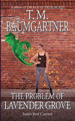
I mean... I think it looks better with a drop shadow. I think my main problem is that the light is coming from different directions in all three images. (Scratch that — my main problem is I'm not a visual artist. But whatever.)

New version:


Previous version for comparison:


Sunday, May 7, 2023

This is Why Professionals Get Paid

Here we have an example of two steps forward, one step back.

The dragon still isn't working, but you can definitely see it better, so... I don't know. Maybe I'll look for a different dragon that isn't so monochromatic.

Fading out the bottom makes the text much more readable. I opaqued the bricks slightly, but it's hard to tell I did it.

Oh well. It's an interesting exercise. And honestly, this is better than a significant percentage of the urban fantasy covers out there.

Here's the new version:


And the previous one for comparison: