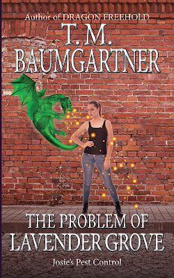
Here we have an example of two steps forward, one step back.
The dragon still isn't working, but you can definitely see it better, so... I don't know. Maybe I'll look for a different dragon that isn't so monochromatic.
Fading out the bottom makes the text much more readable. I opaqued the bricks slightly, but it's hard to tell I did it.
Oh well. It's an interesting exercise. And honestly, this is better than a significant percentage of the urban fantasy covers out there.
Here's the new version:
And the previous one for comparison:


2 comments:
You are good at this! I agree there is something about the dragon that isn't working. It looks rather flat. I shudder to suggest it but I wonder if a subtle drop shadow might help.
It sounds like a good thing to try! (Now I'm off to find a video...)
Post a Comment