Another detour, but at least this time it is cover art related.
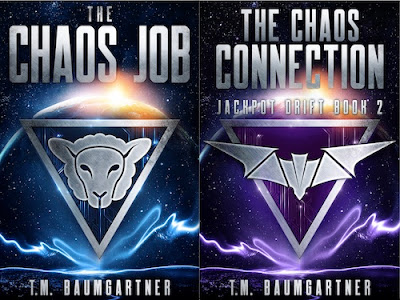
I have a short story that I give away to people who join my newsletter. It takes place in between books one and two of the Jackpot Drift series, which have covers that look like this:
So... I know I don't have the skills to make something that matches closely, but if I can create a cover that at least looks like it belongs in the same universe, I'll be happy.
It's a little hard to tell from the picture above (since I cut down the resolution), but there is a circuit pattern inside the triangles. I'm starting there, with this image I licensed from DepositPhotos.
First off, I wanted to make that more blue than teal, so off to the colorize option we go...
That's fine, but I actually would like some stars in the background. So a little Hurl noise, then messing with the color levels, desaturation, and finally sparkles, and we have this:
The big challenge is going to get the typography to look somewhat close. Brushed metal? In that font? That will be a challenge for tomorrow.


No comments:
Post a Comment