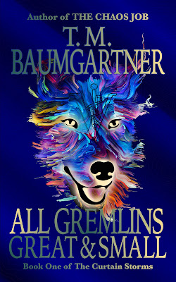
I wanted to play around with the typography a bit since that's one of my bit weak points.
First I tried switching it to a font called Iowan Old Style, which... looks almost exactly the same.
Then I tried switching the "Great & Small" part to a fancy curly font, which made it look like a strange romance book and I laughed so hard I forgot to get a picture before I backed that change out.
The white font is a bit stark, so I randomly hit buttons on getting a gradient there, and got this.
Those colors are something technically called "terrible", but it's an interesting effect. I may play around with this a little more later. The more things I try to do in InDesign, the more I will figure things out.


2 comments:
You will love InDesign in time. It's a great program.
I would love it a lot more if they hadn't gone to the subscription model... :)
Selecting and using colors in InDesign isn't intuitive to me — there's some key piece of the workflow I'm missing. But it's also one of the things I've used the least, so I'm hoping it will resolve itself as I use it more.
Post a Comment