Sunday, February 6, 2022

Cover Art (Day 6)

 Today I wanted to play with backgrounds...

The book involves hiking, so at first I thought about using some sort of outdoorsy background. I licensed this photo, but that doesn't really work.


I can make them sort of blend by using "soft light" mode, but now it looks like my book is a religious book about dog angels, which isn't quite the genre I'm aiming for.


Okay, but if I watercolorize the background and then mess with the colors, it's kind of interesting... Still not what I need, but interesting.


Back to the drawing board.


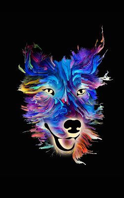
This one has just a simple generated background and then a "hard light" mode combining the layers, which modifies the colors of the painting a bit, but also makes them come together better.

(I'm guessing this is the point when I should admit I don't understand the different ways of combining layers, so I'm just a monkey pressing keys when I change things. Maybe I should look that up.)


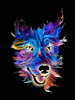
This is boring, but it's an idea.

The black background it started with is really looking good at this point, isn't it?

I need to learn some things about combining layers next, I think...

Saturday, February 5, 2022

Cover Art (Day 5)

Okay, so after I posted the entry yesterday, I remembered that I'm in a FB group where people can go to ask for help when making covers. I posted this image and said "Hey, how do I do something like this?" and they were very helpful.


Mostly I just needed them to tell me what words to search on, and so I can figure this out the next time I want to do so: bevel. There was also some discussion about lighting which went way over my head (which may be a reason for me to pay someone else to do this, but... whatever).

Anyhow, this is what I finally did in GIMP:

  • On the layer with just the caduceus, Filters->Decor->Add Bevel...
  • Save the bumpmap
  • Then activate the layer to make bumpy, and Filters->Map->Bumpmap... and click on the Aux Input section.
(Now that I've written that out, it's clear why I never figured this out on my own.)

So I tried this in a couple of different places just to see how it stands out. It's in this image twice — once at the bottom and once in the dog's forehead. I think it's too subtle in the forehead, so I'll either need to put it on a fairly static area or work on making it stand out more.

Anyhow, Route 8 also had a suggestion about layer opacity yesterday, so I may play around with that tomorrow.

(But I also wonder how it would look if I did the whole dog's head embossed. Yes, I am about to fully fling myself over the edge into Way Too Much, but I have to fill 28 days somehow...)

Painted dog's head with the vet caduceus embossed in two places.


I also downloaded a more recent version of GIMP today and it's so much easier to select things when you can see the selection markers! It was a thing that broke when I got my new laptop and I kind of forgot about it.

Friday, February 4, 2022

Cover Art (Day 4)

Okay, this may be when I really start heading off into the weeds. But I wanted to try different things.

I've been reliably informed that if you never fail, you aren't trying hard enough.

Playing with the logo... This time I used the logo as a mask, expanded it, and copied that part of the main picture. Then I put the logo down on it again.

Colorful painting of a dog's head with the vet logo in a similar color map below

Obviously the logo wouldn't be placed where it is now — that area will have the title. Overall, I don't think this attempt gets me much closer, but it was something to try.

Thursday, February 3, 2022

Cover Art (Day 3)

Continuing on with the cover art changes (and again, let me stress, this may all go horribly wrong and it's not like I know what I'm doing)...

There are a couple things I think should probably change.

  • The plain black background might be too plain. If I can make it more visually obvious this is SF/F, that would be good.

  • I'd like to make the veterinary connection more obvious as well.

Background Layer

Because the background was a solid black, a few minutes in GIMP (free photomanipulation software — think Photoshop without the BS subscription fee) let me split the image into a separate layer. I added a separate background layer here just to make it obvious.

I also made the final image taller so I'll have room to adjust up/down when I go to put the typography on. (Yes, I am trying to learn from past mistakes.)
Painted dog face with black background replaced by purple


Now the question is... what do I want to use in that background layer? Um... I'm not sure yet.

The Veterinary Connection

I think I may want to have some effect like this one (also licensed from DepositPhoto).

Image shows a rainbow swirl with a staff & snake embossed


The image I'd like to use is something like this (also licensed from DepositPhoto):


Do I have any idea how to create that effect? Not really.

So I guess tomorrow I'll try to figure out how to do that...

Same painting with the caduceus put on top

We shall see how much I can screw things up tomorrow!

Wednesday, February 2, 2022

Cover Art (Day 2)

 Okay, so I've chosen the art for the cover. That's it, right?

Well... not quite yet.

(I just realized I should put a disclaimer here: I'm not a professional cover designer. That should be really obvious to anyone who knows what they're doing. I've picked up a few tricks along the way, but if you learn anything at all from this, it should be things that you want to think about in a cover, not things I've done.)

Okay, that's done with. Let's get back to this cover.

Proportions

First off, it doesn't quite have the right dimensions. Here's what it looks like if I change the frame to be the right proportions:

Image shows a colorful painting of a dog's head with a band of bright pink above and below


Note there's space at the top and bottom. That's actually a good thing — I need space for my name at the top and the book title at the bottom. In fact, there may not be quite enough space yet. So it's possible I'll have to either shrink the picture or mask it in some way so the text shows up, but I'll worry about that in a bit.

One thing I should point out: the image has a nice slant from upper left to lower right, which will help draw the viewer's eye correctly (for English readers who read left-to-right, top-to-bottom — it's a whole thing and I'm sure there are articles about it. All I know is that I want an image that draws the eye about like this.). If the image hadn't already been positioned like this, I would have flipped it around to get it this way.

Background

Obviously I wouldn't want it to have those purple/pink bands. I just used those to make it obvious where the image started. Here's the same thing with a black background.

Image is the same as the one above, but the bright pink bands are now the same color as the black background.

I'm not going to lie. I would consider using this like this. But it doesn't quite say science fantasy (or whatever genre I'm calling this novel...) yet. And I think I'll probably want a bit more going on in the background.

Tomorrow I'll try some background stuff...

Tuesday, February 1, 2022

Cover Art (Day 1)

It's Thingadailies time again, the month in which I create one thing per day and post it here.

Last year I went with the theme of "Space Kittens", and I'm not sure how I could ever top something like this.

This year I've decided to combine work and play to create the cover for book one in my new series. The book's title is All Gremlins Great and Small. As you might have figured out, the main character is a veterinarian.

This book is science fiction or maybe science fantasy, in the contemporary world. (Yes, the fact that I can't nail down the genre does not speak well for my ability to sell this thing once it's finished.) Like most of my books, it has a strong, competent female protagonist, and though there are some bad things going on in her life, overall it's a book that should make you feel good when you read it.

So... images. It's possible I should be using images of people on the cover, but I can never find anything I like, possibly because I hate covers with people on the front. (Am I shooting myself in the foot here? Possibly.) But I did find a bunch of images that I love, and this will be a series, so I'm starting with this (which I've licensed from DepositPhotos):

Image shows a dog's head, painted in bright primary colors on a black background.

It's joyful, it's colorful, and the fact that a friend described it as related to Lisa Frank probably explains why I love it so much. In a perfect world, I would pay this artist a bunch of money to paint imaginary creatures in this style, but I don't make enough to throw that kind of money around, so I'm starting with this image.

Tomorrow I'll go over some of the things I need to modify in order to make this work as a cover.

Tuesday, January 4, 2022