Thursday, February 29, 2024

Day 29: Bad Magic

Welcome back to Thingadailies.

If I were plotting Thingadailies, I would be ending on a high point — maybe an image that showed off all the skills I've learned this month. But no. I'm ending the month with something random, which is totally in keeping with previous Thingadailies.

After trying to find something I wanted to do, I settled on this tutorial on Glowing Magic Effects, which would be practical for me to learn. Unfortunately, I wasn't really in a "follow the directions" sort of mood, and also, it turns out I have no idea how to determine the saturation of a color. So I diverged from the tutorial pretty quickly.

Still, it was kind of interesting, so I'm leaving it here. (Also, I have to post something.)

Step 1: Draw the basic shape with a color that has 50% saturation.

Or, if you're me, ignore that thing about saturation because it's a word that doesn't really have any meaning, and pick a color and draw a shape.


Step 2: Sketch out the curves so it looks more smokey

Step 3: Increase the saturation and add highlights.

The interesting thing here was switching the pen mode to "dodge". Also I had started messing with colors by this point.


Step 4: Ignore the tutorial and start adding random colors.


Does it look like a stream of magic? No. Did I follow the tutorial? Also no. But I did end up with kind of a cool swirled thing.

That's it for Thingadailies! Join me next year!

Tip of the day:

Switch the pen mode to get different effects. Dodge is a fun one.


(Just added the tags and it turns out the "Not following directions" was a tag that already existed. Excellent branding, T!)

Wednesday, February 28, 2024

Day 28: Northern Lights

Welcome back to Thingadailies. Today I decided to follow this tutorial on creating northern lights.

Step 1: Find a picture of the night sky

DepositPhotos is my friend here. (Depositphotos_243388432)


Step 2: Add a purple gradient as a background to the northern lights

The first time I did this, the purple disappeared when I switched the layer to overlay mode. I ended up desaturating the original picture and then adding the overlay. (Was there some other way to do that? I don't know.)


Step 3: Add some green
In this step, I used a brush with the jitter turned up so it gave me a bunch of somewhat random blobs.

Step 4: Linear motion blur

For whatever reason, I couldn't get the linear motion blur to work until I resized the canvas to something smaller, which was fine in this case because I started out with something huge — I resized it down to 3500x2500 pixels. It started out as 11850 × 7908. But still, I'm not sure why GIMP just didn't do anything with the linear motion blur instead of... crashing or something obvious like that.


You can see things are starting to take shape.

Step 5: Repeat (on different layers) those steps for a couple other colors


Step 6: Firm up the lower edge


Step 7: Warp it

Yes, this is where GIMP really falls down. So I moved into Photopea.

(Why didn't I use Photopea from the start? Mostly because I'm familiar with GIMP. But also because Photopea has a bunch of moving ads on the side and I'm too cheap to pay $15 to make them go away for three months.)

After warping it, we did another linear motion blur, this time horizontally, in order to get rid of the lines.

I think I switched the layer combination to "hard light".


Step 8: Repeat

Copy the layer a couple times, warp the layers, and change the opacity to make things blend.


And there we are. Northern lights!

I think I could have blended the lower band of light with the green band a little better, but it's a decent first try.

Tip of the day:

To warp in Photopea, Edit->Free Transform, then click the Warp button on the upper right.

Tuesday, February 27, 2024

Day 27: Everything is Better with Glitter

Welcome back to Thingadailies. We're currently working on a version of this Cat Butterfly Manipulation Photoshop Tutorial.

Today we're going to finish this image and prove that everything is better with glitter!

When we left off yesterday, Sabrett was facing the dragon:


Step 1: Get some glitter/sparkles

(Yeah, I went ahead and spent another $0.33 on this. Trust me, I'll use it again.)


Step 2: Use the "screen" option to infuse the sparkle layer into the image

I spent twenty seconds looking up what "screen" actually does, found the equation that explained it, and decided I would just accept it pulls bright things in and makes them brighter. We ended up with this:


Step 3: Create one visible layer and change the "camera raw" settings to make it look better

Okay. So for the most part, GIMP contains nearly every feature found in Photoshop. But this was one of the exceptions. It looks like I could download some filters to do this. Honestly, if I knew what I was doing, I'm sure I could do all of it through the other features already available in GIMP.

But today I saw a link to Photopea — a free Photoshop analog that runs in your browser — and I wanted to try it out. So I exported my file as a .psd file and pulled it into Photopea. I'm pretty impressed with how responsive it is. And it had most of the "camera raw" settings that were used in the tutorial.

Anyhow, I increased the temperature and contrast and it looks very spiffy. I'm calling it good.

It would look even better if I'd started with a less blurry kitten picture, but we can't have everything.

What should I do for the next two days? I'll wander through some available tutorials and see what I can find...

Tip of the day:

To get the sparkles to shine, use the "screen" option.


Monday, February 26, 2024

Day 26: Needs More Dragon

Welcome back to Thingadailies. We're currently working on a version of this Cat Butterfly Manipulation Photoshop Tutorial.

Here's where we were yesterday:


The further I get, the more I think my background choice was a mistake, but this is how we learn things, right?

Moving right along...

Step 1: Add the butterfly dragon

I already own this dragon image, so I decided to use it.

It's an odd image. I feel like I should be able to easily change the colors, but I've never successfully managed. This time, I tried this:
It doesn't look great, but I'm hoping the it will be okay since it will be tiny and have a bunch of shining lights obscuring it.

Step 2: Add shining lights

Okay, so the tutorial added an image to do this. I thought (and still do think) that I should be able to do this by adding a supernova followed by gaussian blur. And it sort of worked, but I'm not sure if it doesn't look as good because I didn't start with the bright colors of that butterfly or because the supernova didn't produce the same effect.

Step 3: Light up the cat

I tried a bunch of different things (color balance with masking, airbrush painting directly, using the burn/dodge tool to make the back of the cat darker) and I'm not completely satisfied, but it's...okay?

Step 4: Add a light reflection in the cat's eyes

This helps a lot.

Anyhow, here's the current image:


Tomorrow we add glitter/sparkles, which was one of the points of this exercise. Stay tuned!

Tip of the day:

Picking a tabby or solid color cat would have been easier than using this photo of a calico, because overlaying colors has different effects depending on whether the fur is light or dark.

Sunday, February 25, 2024

Day 25: Needs More Fur

Welcome back to Thingadailies. We're currently working on a version of this Cat Butterfly Manipulation Photoshop Tutorial.

When we finished yesterday, things were looking a little odd.


Though really, can you really go wrong with a kitten in the picture? I say not.

Today is all about trying to make it look like the kitten and the background belong together.

Step 1: Darken the kitten and adjust the color balance

Presumably people who know what they're doing have a logical process for this, but I just tried to make it so the kitten and the background might possibly exist in the same universe. It still looked like I'd copied a picture of a kitten onto the background, but this made it closer.

Light will be added back later, so don't panic (yet) because it seems too dark.

Step 2: Fix the kitten's whiskers

This happens at the very end of the tutorial, but it was bugging me, so I did it now. They really ought to be a little thicker, but I think I got close.

Step 3: Add more fur. No, more than that. Keep going.

The key to making it look like this isn't a cut/paste of a kitten is using the smudge tool to recreate the kitten fuzz that got shaved off when removing the background. And the more I added, the better it looked.

So here we are!


Tomorrow, I'll add the butterfly (or whatever I use instead of a butterfly).

Tip of the day:

If you increase the flow rate above zero when using the smudge tool, it adds in the foreground color. (Yes, I found this by accident and couldn't figure out what was going on. But I can see this being useful.)

Also there's a "Sample merged" option in the smudge tool which makes it so you can smudge from any visible layer.

Saturday, February 24, 2024

Day 24: Time for Something Lighter

Welcome back to Thingadailies. After the doom and gloom book cover of the last few days, I've decided to go back and do a version of this Cat Butterfly Manipulation Photoshop Tutorial both because it's lighter and also because I want to try what they did with the sparkles near the end.

But since I have no idea how they're sourcing their pictures, I'm going to find my own. So it won't be identical.

Step 1: Find a cat

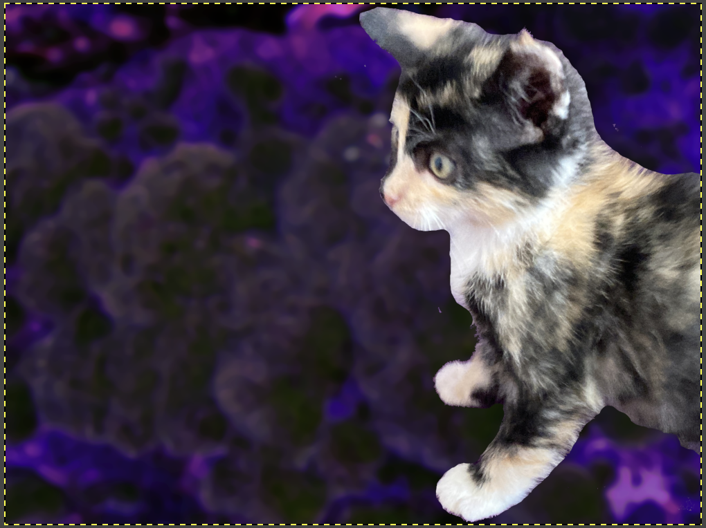
Ha! This was not a problem. I went with this image of my former foster kitten, Sabrett, of the reluctant weaners litter
.

Sabrett is on a lovely purple background, which might be a bit of a problem (because it really doesn't blend with her fur), but we'll work about that after I've chosen a background for the image.

A bit of quick and dirty isolation, and we have this. If I choose a dark enough background, I think the purple tinge around the edges won't matter. But if it does, I'll need to go in and clean up the edges more. Because of that, I'm holding off on adding hair to make it look less like the cat has been cut out. (I'll revisit this later.)


Step 2: Find a background

The tutorial started with a city at night scene, blurred it, and added a blue overlay. I'm starting with this:

In retrospect, the linear nature of the city scape might be a better choice, but I'm going to run with this for a while. Anyhow, I darkened it and messed with the colors, and now I have this:


Step 3: Rescale the cat

Really happy I didn't spent too much time on the back half of the cat now.


I promise this will look better soon! But right now, I need to go bathe the current foster cat in lime sulfur and bleach the heck out of the bathroom, so it will have to wait.

Tip of the day:

Don't give up on the project because it looks like crap now. Wait until you've really screwed it up.

Friday, February 23, 2024

Day 23: Let's Finish This

Hello, and welcome back to Thingadailies!

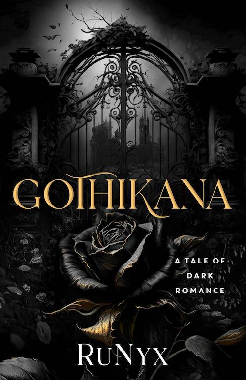
My current project is a re-imagining of the terrible AI-generated cover image for this book:


After a few days of working on this, I've realized I just don't like the original image at all. Everything is in deep shadows and you might as well just slap the title on a black background and call it done. So... I'm finishing this up today and I'll work on something else for the rest of the month.

Also, I forgot to take screenshots as I was working, so this will just be a before and after.

This is where we left off yesterday:


Step 1: Add a castle or building. 

Yes, if you squint at that picture, there's a building on the other side of the gate. This is Depositphotos_23183842. (I think I've now spent an entire dollar on my spite-recreation of this image.)

I decided to go with the castle piece on the right.

Step 2: Get rid of some of the bars on the gate

Once I had the building in place, it was obvious the gate was occluding too much, so I removed half the bars. It still looks very solid, but now it's possible to see the castle.

Step 3: Add a light on the castle

Okay, this wasn't really part of the original image, but I felt like it needed something to relieve all the freaking dark gray and black. I made the light yellow so it would echo the color on the rose.

Hey, it's my picture, so I can do what I want.

Step 4: Add some yellow highlights on the plants surrounding the gate.

Again, mostly this was just to relieve the tedium of this image, though there's a bit of this in the original.

Step 5: Add some trees

Aside from some random branches growing out of nowhere, the original doesn't really have trees. But there needs to be something breaking up all the fog. The AI-generated version accomplishes this by have random "stuff" appearing in mid-air, which fools the eye until you look at it and wonder WTF that thing hovering in the sky is supposed to be.

I used silhouettes of trees I photographed during my walk yesterday. Free trees, baby!

Step 6:  Add the rose

I'd created the black & gold rose a few days ago, so I imported that and messed with it for a few minutes to add some more shine. I definitely didn't succeed in making it look like metal, but I think it fits in the image anyhow.

And here's the final image. You can probably see more detail if you click on it.


I'm too lazy to figure out the typography in order to really compare the two images, but overall, I think this turned out pretty well. It's certainly not any uglier than the original.

Tip of the day:

Pick a practice project that isn't so dark next time...

Thursday, February 22, 2024

Day 22: The Wall

Welcome back to Thingadailies!

In case you've forgotten, I'm doing a low-budget, no-talent recreation of this AI-generated book cover. For science!


When we left off, I had a gate, an arch of thorns, some spooky background fog, and a rose that I haven't imported into the main project yet.


Step 1: Make the gate more substantial

I decided the bars on the gate needed to be thicker, so I selected everything, increased the selection by 5 pixels, then dumped black everywhere. I did reverse that in a couple places because it looked too chonky, but I think this works better overall. (I'm still debating whether to take out a few bars — it will probably depend on how it looks when I add the castle behind the gate.)


Step 2: Add walls around the gate

Sure, the original has something that may be stone walls or at least pillars of some kind. And I probably could have found something in DepositPhotos that would have done the job, but I decided to see what I could find in my neighborhood. Hey, I'm out walking the dog anyhow.

I found a few stone fences that I probably could have made work, but then I found this:


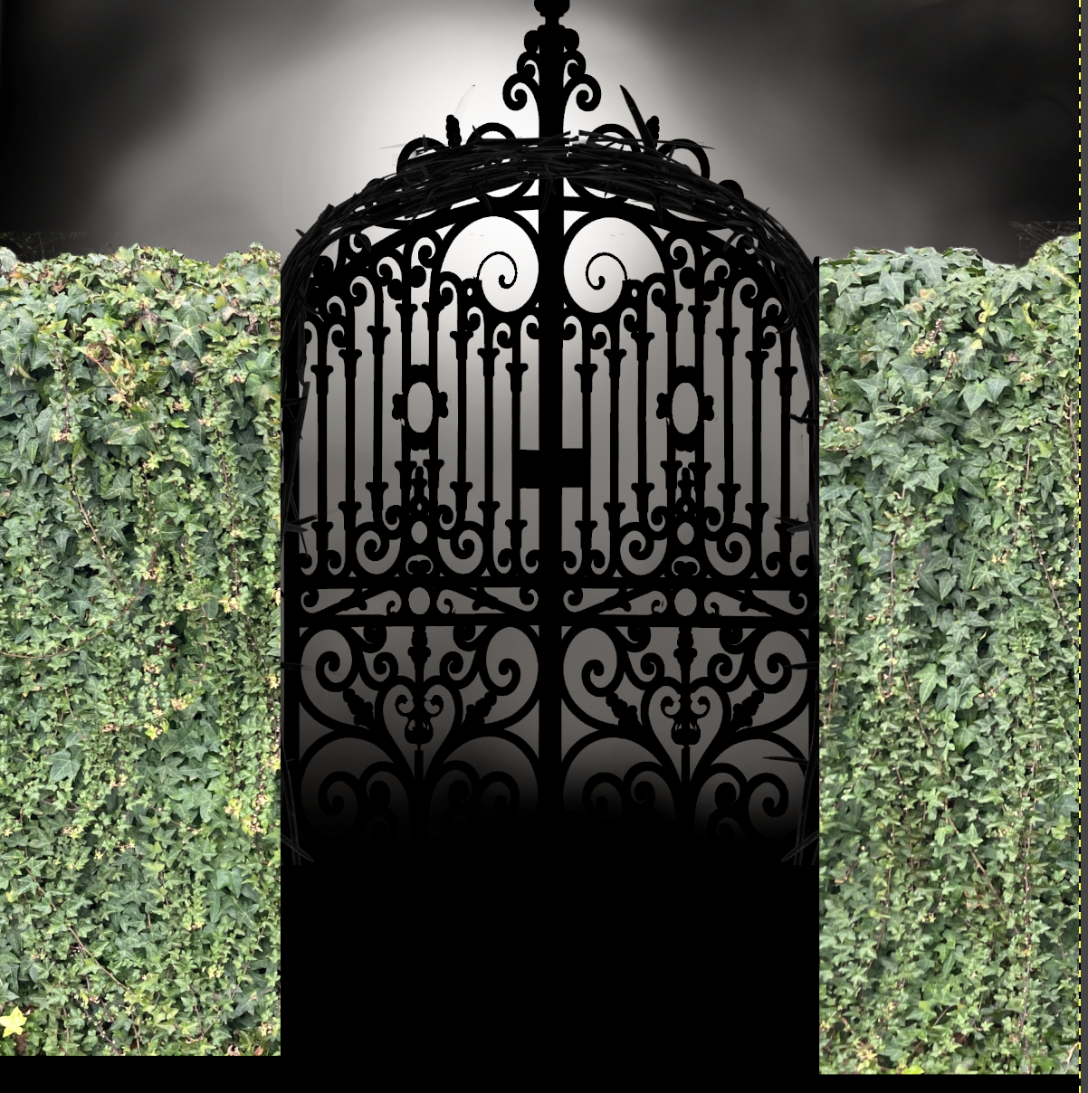
One of the things the bizarre AI-generated image offers is a weird sense that things that aren't living (like metal gates) may be alive. So I decided to add more life into my version by using ivy as my walls.

First we get rid of the sky, then we bring the ivy wall into the main picture. It starts out like this:


And yes, that looks horrible, but we're going to desaturate everything and make it so dark you can't see anything anyhow...

So there we are. Tomorrow I'll add a castle, and maybe some trees.

Tip of the day:
Adopt a dog so you have a good excuse for taking pictures of random objects in your neighborhood.


Wednesday, February 21, 2024

Day 21: The Gate

Welcome back to Thingadailies!

To refresh your memory: I'm currently working on a terrible interpretation of this craptastic AI-generated image. (On a book that got sprayed edges! Why would you make a special edition book and use this image?)


Yesterday, I worked on the rose/cabbage. Today, I messed with the background layer and the gate.

Step 1: Make the arch

I couldn't find a gate with an arch in the stock photos, so I decided to make my own. If I'd really wanted an arch, I probably could have found something decent in the Daz3D store, but that way lies madness large credit card bills. So instead, I bought some thorns.

(Side note: I thought it would be easier to buy an image of brambles or something thorny, but all they have are a bunch of thorn crowns. Many, many thorn crowns. Far more than is reasonable. Looking for thorn pictures on DepositPhotos leads you to the religious torture porn section that should be in a little room at the back of the store.)

Anyhow, I got this image:

With some judicious copying, stretching, bending, and masking, I create this:


I will not lie. There was much laughter about having veered off into a ditch at this point in my progress, but I think it sort of comes together later.

Step 2: Get some gates

I found some reasonable gates on DepositPhotos, though they weren't as separated from the background as I would have liked. But after some messing around with the levels, I succeeded.

I might lop off the spike at the top later. I'm still thinking about it.

Step 3: Make a foggy spooky background

I just used the airbrush tool, which is now my favorite tool. I may go back and mess with this, but it's close to what I wanted.

Anyhow, this is where we currently are (with the rose waiting to be imported from the other file after I finish messing with it.)


I mean, yeah, it's objectively bad, but I think it's heading in the right direction.

Tip of the day:

Don't try searching for thorns in DepositPhotos.

Tuesday, February 20, 2024

Day 20: Switching Gears

 Welcome back to Thingadailies!

Now that I have completely butchered mastered the tutorial, it's time to find something else to work on. I was going to start on this Cat + Butterfly + Sparkles tutorial, but I decided to wait on that because I heard about the latest "publisher uses crappy AI art on a book" catastrophe.

If you want the full explanation, this video covers it pretty well. But if you just want the short form, this is the cover in question:


The darkness covers a multitude of sins, but the more you look at it, the worse it gets. Like all AI-generated images, things sort of make sense until they don't. Like gates that contain floating bits of iron and aren't symmetric...


And the branch randomly growing out of... iron? a clump of weird leaves? The rest of the tree doesn't exist.


And the nearby random crud, which could be birds or leaves but is really just random crud floating in the sky:


Anyhow, the really annoying thing for me is that if you look at the original book cover, the image isn't that complicated. A good artist could create the same composition and it would look a whole lot better.

So, of course, my next thought was... Here we go! My next project!

(Also, Karen complained that so far this Thingadailies, there hasn't been a spectacular fail. This ought to take care of that.)

Note that I said a "good artist" could do this. I am not a good artist. I'm not even halfway competent. But let's see how close I can get!

Step 1: Get a rose

First off, I'm not sure that thing on the book is a rose. It might be a cabbage. But I feel like a rose is more in keeping with the dark romance theme, so I went with a rose.

I spent something like $0.30 on this picture of a rose. (Depositphotos_246638650)

It's a very nice rose and somebody else has already done the tedious work of isolating it from its surroundings.

Do I know how to make something look like gold metal is coming through? Absolutely not. But I'm going to try my best.

Step 2: Desaturate the rose and drop the levels


Step 2: Add some gold yellow highlights

Step 3: Add some orange to the highlights


Step 4: Add a layer shifted toward white to add more light in some areas

Step 5: Do it again, but more!


Okay, so that's where we stand at the end of the first day. Does it look like the one on the book? Not at all. But for me, I think this is pretty good.

Tip of the day:

Publish your own books so you don't get saddled with an AI nightmare of a cover (unless that's what you desire).