Tuesday, February 28, 2023

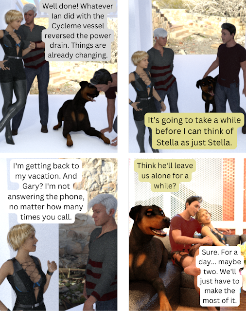
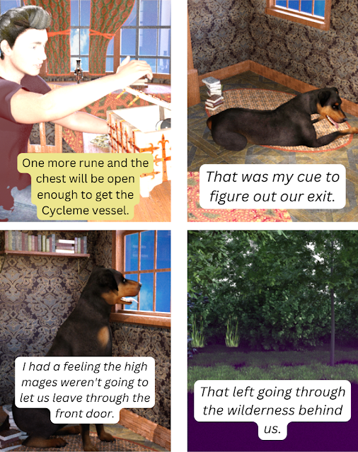
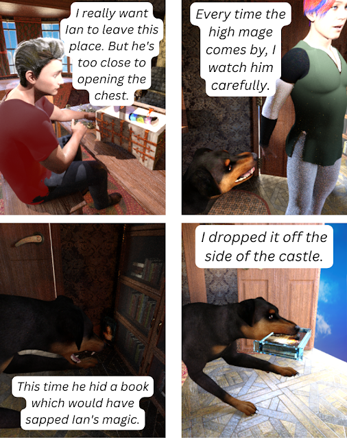
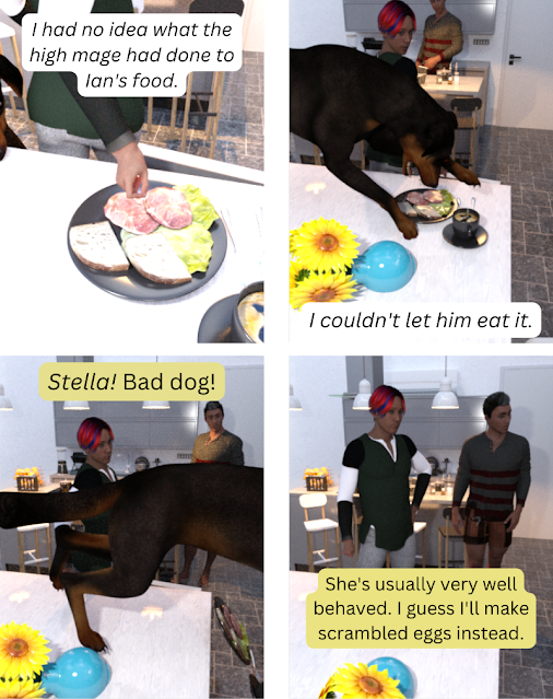
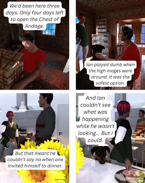
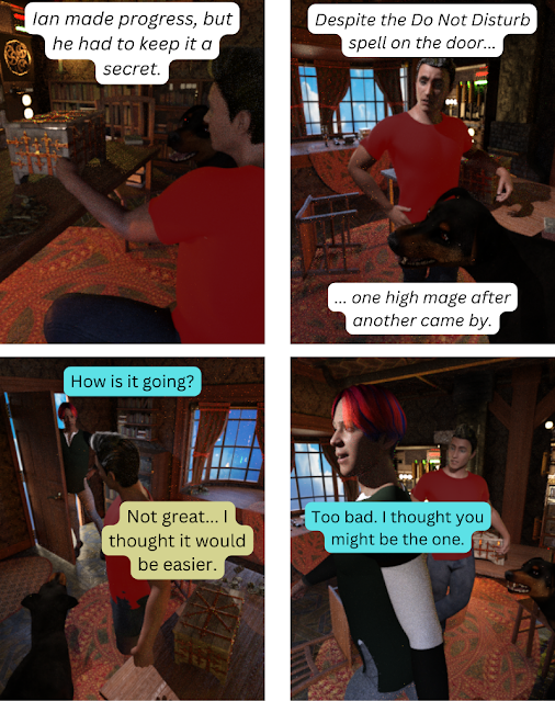
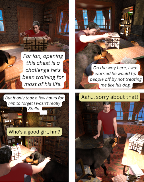
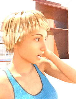
Webcomic: Day 28

Want to see where this all began? Start here! It's hilarious, I promise. (Uh, not the story. My attempt at making a webcomic.)


Things I learned today

  1. First off, I had to look back to the beginning of the month to find the link above, and wow, I really have gotten better. Go, me! I had trouble with the lighting on the last panel and I mostly fixed it!

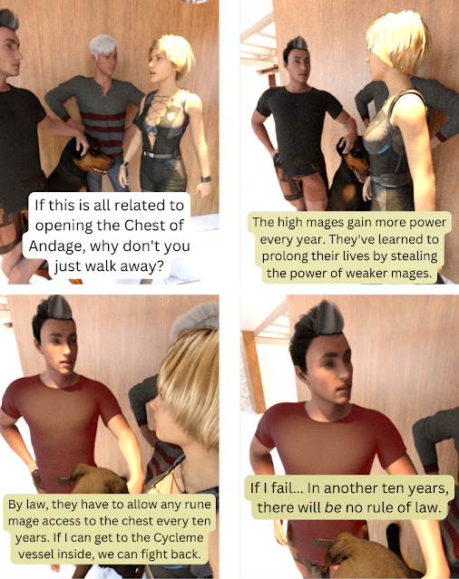
  2. I totally forgot Gary was a Genesis 9 and thus looks nearly identical to the high mage Genesis 9. But Gary has a smile, so clearly they are different people. Also, they have different clothes.

  3. I have learned a ton about how to place objects. I think my next step will be to see how close I can get to the Jackpot Drift series cover images I want without buying a bunch of new stuff. (That was the end goal with all this.) I think I'll probably end up buying things, but it's kind of amazing how much things can be repurposed just by changing the size and color.

Monday, February 27, 2023

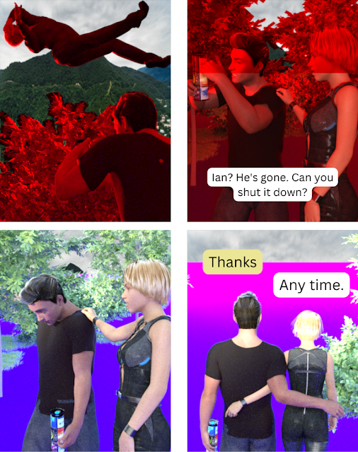
Webcomic: Day 27


Things I learned today

  1. Why is there a red line halfway through Char's face in the second panel? I have no idea. The fog maybe? There's always something new.

  2. It's hard to get emotional arcs in four panels with no art skills. This attempt at a webcomic makes me appreciate things like Questionable Content even more.

Sunday, February 26, 2023

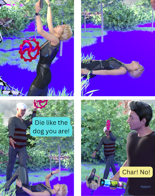
Webcomic: Day 26


Things I learned today

  1. I'm still trying to figure out how to signal a big burst of magic or anger or whatever. The red in panel four is one approach. It almost works. I think I should have focused in tighter on Ian, though.

  2. ONLY TWO MORE DAYS!

Saturday, February 25, 2023

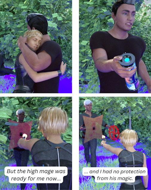
Webcomic: Day 25


Things I learned today

  1. Did I learn anything today? I'm not sure I did. I'm getting a lot faster at this — the renders take 10-15 minutes (or however long it takes until I think they look good enough), but getting the characters in position is faster now.
    So I guess what I'm learning is muscle memory stuff. There's something to be said for that.

Friday, February 24, 2023

Webcomic: Day 24


Things I learned today

  1. I really wanted the high mage to throw balls of magic, and I thought I could do that by creating pinpoints of light, but that just produced a black canvas, so... There's probably some simple solution, but I'd need to search for it.

  2. In the absence of magic balls, I went with what I had. The shield is a shuriken from the Lynx package (which includes what Char is wearing) made super big and with a bunch of parameter changes. The red wheel o' death is a cog from the workshop, again made big and with random parameter changes. Mostly I made them both big because I couldn't find them after I added them to the scene. Freaking ivy.

  3. Yes, the shield/shuriken has a hole in the middle. You aren't supposed to notice that.

Outtakes

Hug, attempt #1. Soooo close!


Thursday, February 23, 2023

Webcomic: Day 23


What I learned today

  1. Mostly I learned that stray leaves in the scene can be an absolute pain in the butt to work around. That ivy...

  2. Why does Ian look like he's wearing some weird makeup in panel 3? I have no idea.

  3. Okay, I think I've mentioned before that when I roughly outlined this 28-day webcomic, I'd planned for a romantic component. Then I ended up with Chad and Princess Vacuous (who are both growing on me). But now I'm realizing how hard it will be to get them to hug each other without someone's arm going through someone else's torso. Oh well. It might be funny.

Wednesday, February 22, 2023

Webcomic: Day 22


Things I learned today

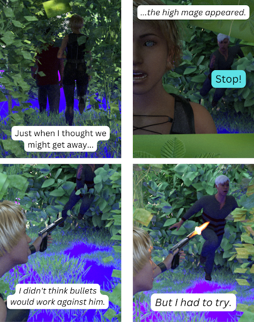
  1. The muzzle flash isn't tied to the end of the gun. Maybe because sometimes the suppressor is there and sometimes it isn't? I don't know. Anyhow, I'm pretty sure there are some random muzzle flashes floating around the scenery because I added a few of them before I found one.

  2. Speaking of muzzle flash — it's waaaay more obvious when rendered than it is on the quick shaded version. (For everything else, it's the other way around.)

  3. I can't decide if the fog was a great idea or a terrible idea. It hides the lack of ground. But it really messes up the lighting.

Tuesday, February 21, 2023

Webcomic: Day 21


Things I learned today

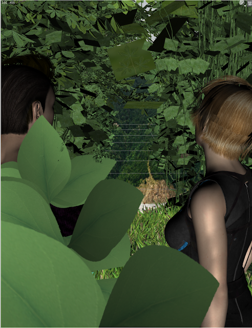
  1. I need to calm down on the purple fog a little. I was expecting the mountains in the background to show up, but when I rendered it... just purple in the distance.

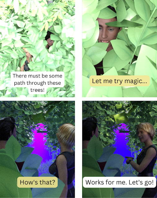
  2. Ivy makes a great tunnel.

Outtakes

This is what it looked like without the fog...


Monday, February 20, 2023

Webcomic: Day 20


Things I learned today

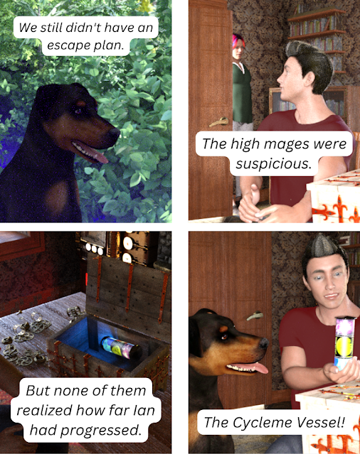
  1. If the prop isn't attached to the character (like Char's gun, which stays in her grip no matter how I move her arm), get the characters in place first, and then move the prop to where it needs to be. I kept having to move that stupid cylinder thing around because I wasn't happy with the character poses.

    Is there some way to attach the thing to his hand? There might be. I'm not sure how hard it would be.

  2. Lighting... I think I have it mostly figured out, and if I'd been willing to spend more time on things today, I could have fixed them. But I have a book to edit, so...

Sunday, February 19, 2023

Webcomic: Day 19


Things I learned today

  1. I was playing around with the lighting to make it more dramatic, and for the most part it worked.

  2. Maybe I should have found something more flashy to be the magic object. Too late now!

  3. Adding trees or ivy and giving them odd colors can add a certain something to the outdoor scenes.

Saturday, February 18, 2023

Webcomic: Day 18


Things I learned today

  1. Varying the size of the node instances is a nice touch.

  2. Once again, I don't understand the lighting. I did something and suddenly it was all really dark. Maybe the angle of the tree blocked the sun? Let's pretend the backlit characters on panel three was an artistic choice.

  3. I'm not sure my attempt at motion worked. Oh well.

Friday, February 17, 2023

Webcomic: Day 17


Things I learned today

  1. I created an outdoor scene and added trees and grass, using multiple instances (instead of copying each individually). I'm pretty sure I could make it better by varying the individual instances (which would be pretty quick), but I'm pretty happy with how that turned out for twenty minutes work.

  2. I added purple ground fog which... hides the fact that there's no ground in some places, but I don't think is high enough to actually look like fog. I'll play with parameters later.

  3. I got a weird checkerboard pattern until I told it not to show the ground in one of the render settings. Except then I realized that pattern was just showing up because it was a png file (which has transparency) and wasn't really there.

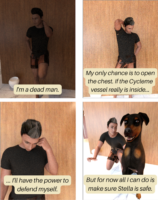
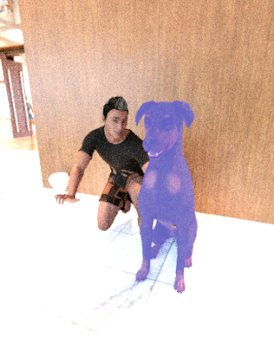
  4. Got closer with the inside lighting today. Lesson learned: the dog needs more light than the person. I'm not sure if that's something about the dog's coat parameters, the fact that the dog is dark, or just that the person is up higher (and closer to the lights) than the dog.

Thursday, February 16, 2023

Webcomic: Day 16


Things I learned today

  1. I almost got the lighting right today, did you notice? At least for the first panel.

  2. I realized part of my lighting problem is the dog, who is dark, is usually in front of dark wood paneling or a dark rug. Yes, it's taken me 16 days to figure out that's a problem.

  3. Light coming from outside is much stronger.

Wednesday, February 15, 2023

Webcomic: Day 15


Things I learned today

  1. I can plan the four panels while waiting to pick up my foster kittens from the shelter. (There's always a 20 minute wait. I really, really want to change their processes to make things run more smoothly, but if I brought it up I'd either offend the staff or have talked myself into a volunteer position. I don't want either of those outcomes.)

  2. Oh, and I realized that while I can't just click on an object and "duplicate" it, I can find the item in the original package and pull it in again. That makes two of them available. (That's how there were two plates of eggs.)

  3. And not that I've finished the final panel, I've learned that I really should have set up the scene so Ian was on the left and Char on the right because that would make who they are talking to more obvious in the third and fourth panels. Live and learn!

Tuesday, February 14, 2023

Webcomic: Day 14


What I learned today

  1. Mostly I just relearned that subtle gestures aren't visible at this resolution (and with the terrible lighting that is my brand). (For example: the high mage is clenching his fist in the last panel, but you can't see it.)

  2. But also, I'm amazed I can do so much with so little talent/training/hardware/money/etc.

Monday, February 13, 2023

Webcomic: Day 13


What I learned today

  1. Upping the environmental intensity (it's a setting) can help disguise poor lighting a little bit. It's a crutch. I'll take it.

  2. DAZ Studio crashes about half the time I save a scene, but so far (knock on wood!) it has always written the files out first. It's going to break me of my paranoid command-S twitch, though.

  3. If you zoom in close enough, there's no difference between someone sitting in a chair and someone standing with his feet three feet below the floor. Just saying.

Sunday, February 12, 2023

Webcomic: Day 12


What I learned today

  1. Since I needed to introduce a new character (a high mage) today, I thought I'd spend some time to make the character memorable and age them up. So I went back to a tutorial that did that, only to find that I didn't have the same controls. Turns out you need the $70 Essential Shapes bundle. Sadly, that would triple my budget for this project.

    (It's a great deal and you should pay for software, but it's not really necessary for what I'm doing and I'm on a budget. Clearly, I need a rich patron who wants to shell out cash for my useless projects. Oh well.)

  2. Subtle changes need to be less subtle at this resolution & size. I opened the chest slightly in the first panel and put a spotlight inside. You can see it if you really look, but it's not as obvious as I thought it would be. This lesson will apply to book covers, so I'll try to remember this.

  3. If only there was a live feed of me trying to get the high mage's expression right... :)

    Unlike the Genesis 8 figure (Ian), Genesis 9 doesn't come with default expressions (though I'm guessing they're in that Essential Shapes bundle). So I was trying to figure out how much nose flare and brow compression I needed to create a sneer. Basically, I sat there making faces at my monitor for ten minutes.

    (Then I rendered it and it doesn't really capture what I was trying to do. Oh well.)

  4. I manually installed some free clothing and then spent a long time trying to figure out where it was in the program so I could use it. Note to self: the Content Library. Maybe there's some database that needs to be updated to get it to show up under Smart Content, but I couldn't figure it out. In any case, the high mage wasn't forced to wander around in a t-shirt and boxer shorts, so it's a win.

  5. JFC, the lighting is going to kill me.

Outtakes

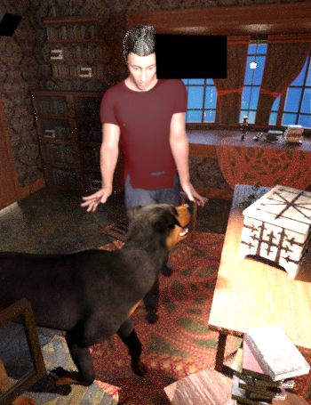
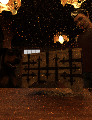
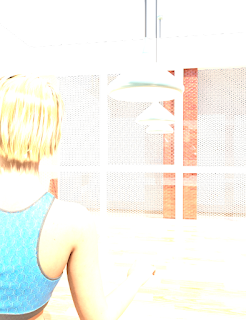
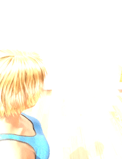
For some reason, hair doesn't show up on characters if you are outside the room looking through a window (at least in the working viewport — maybe it works correctly in the render). I assume that's a bug, but who knows?

Looking through the window


Inside the room


Saturday, February 11, 2023

Webcomic: Day 11

What I learned today

  1. I switched to a different scene today and it has a ton of kitchen and table props. It really does make things look better when there are things lying around on counters and tables.

  2. I didn't mess with the lights at all and this one doesn't look too bad. I'd probably get better shadows if I did three point lighting. Wait, scratch that. I'd probably get better shadows if someone who knew what they were doing set up three point lighting for me.

  3. There was a bowl of soup on the table that I repurposed as a kibble bowl. I ran into a little snag because it had a spoon alongside it (which I didn't want next to the kibble bowl) and that was all one item. So I dropped it into the floor a bit and the spoon disappeared and the dog bowl looked fine. I'm proud of myself for that one.
    (I could have just turned it around so the spoon was on the other side of the bowl from the camera, too.)

Friday, February 10, 2023

Webcomic: Day 10


    Things I learned today

    1. This is going to be really obvious, but... If you put a light in the scene in a spot where it's visible to the camera, the light will show up in the final render. Panel 3 has a rectangle of light pointing at the camera. On an outtake of panel 4, I had the camera behind the light so there's a dark rectangle.

      In my defense, it's hard to get the lights up high and not on the other side of the ceiling. That's my excuse and I'm sticking with it.

    2. Mostly I learned how much I suck at trying to light a scene correctly. This is nothing new. Every once in a while I get it close to right and then I move the camera around and the angles are all wrong again.

    Outtakes

    Oh, hey, there's a big black rectangle near his head because I stuck a light in the middle of the shot. Oops.


    Thursday, February 9, 2023

    Webcomic: Day 9


    Things I learned today

    1. I played with lights today. Lots of lights. Some of them even turned out the way they're supposed to. But I need to mess around with them even more. Either the default brightness is way too low, or there's something else I'm missing, because I have to crank those things up to five times the default value and it still looks dark.
    2. There was enough clutter in this scene that I spent the time to figure out how to make certain objects unselectable so I could interact with the ones I was aiming for.

    Outtakes

    Second attempt with the lights. It was still far too dark and I realized I'd left the chest floating in mid-air instead of resting on the desk.


    Wednesday, February 8, 2023

    Webcomic: Day 8

    (I probably could have framed that final panel better... Oh well!)


     Things I learned today

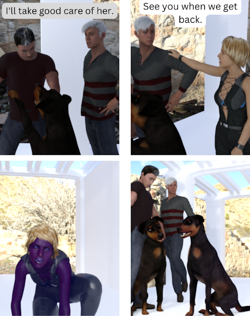
    1. Well, I can tell you what I didn't learn: how to make characters emit light. I think I would have had to purchase an add-on for that, so... Here you go. I could also have done something in GIMP to make the transformation look more magical, but meh. Screwing around in GIMP wasn't the aim of this project.

    2. Hm. The dog was supposed to end up with a blue-ish tint. I think I changed the wrong parameter. (Update: Yes. I needed to change the file used for the Base Color. Not the Top Coat Color.)

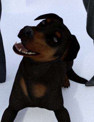
    3. Look at that head tilt on Stella!

    4. Char looked blue until I did the render. Then she turned out purple. Note to self: the colors really don't line up between the preview and the rendered image.

    5. The available poses continue to make me giggle. Ian's back there dancing in mid-air with his chest pushed out.

    Outtakes

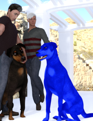
    Hm. I was trying to make the dog a bit blue (to indicate magic), but not this blue. (There's a file that has the dog's coat and I made a copy and shifted it to blue — clearly I went a bit too far.)


    Tuesday, February 7, 2023

    Webcomic: Day 7

    (I don't know. I'm starting to think vacuous is her only expression... But that's okay, because eventually she'll transform into a dog.)


    Things I learned today

    1. Hm. I actually banged these out really quickly, so there wasn't much learning. I am getting faster at posing the characters, though the poses are sometimes a little... unnatural.

    Outtakes

    Dance party!


    Monday, February 6, 2023

    Webcomic: Day 6

     Scenery change!


    Things I learned today

    1. This pergola scene was easier to work with than the office building of the last few panels. It's smaller, so my computer was happier and I had an easier time finding the characters. (I need to go back and rewatch some basic navigation videos — I suspect I'm missing some basic skills.)

    2. I was able to easily copy the characters as a "scene subset" and bring them into another scene. (Then I gave Ian the Newport pants and shoes because I just couldn't take it anymore. Maybe I'll find a different haircut for him soon...)

    3. There was some weirdness in moving the cameras around in the new scene. I think they must have a fixed location that I was fighting against. So add that to the list of things I don't understand.

    4. The "flirty" expression should be relabeled "vacuous". Then again, maybe that's accurate?

    5. There's a little more motion in this group of four and it helps.

    6. I figured out how to move the dog's head. It's not in the standard pose controls, but if you select the neck sections, you can turn and twist. You can't quite get the head tilt you'd expect from a questioning Rottweiler, but it's close.

    Outtakes

    (Not really an outtake, but look at the happy dog!)


    Sunday, February 5, 2023

    Webcomic: Day 5

    Yes, the lighting continues to be random and terrible, but why should the lighting be any different from the rest of it?


     Things I learned today

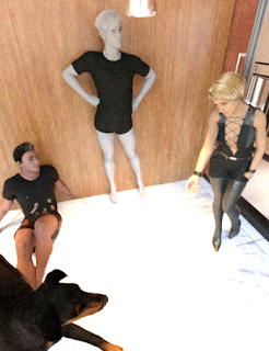
    1. After constantly turning the ceiling on/off (because I can't see where things are unless I have a bird's eye view, but it doesn't render correctly if the ceiling is missing), I found a setting that makes it disappear unless it is rendering the view. Yay.

    2. Chad's Ian's shirt changes color because I was messing with the surfaces. The thing is, it doesn't show up in the new color until I run the render, so I thought that wasn't doing anything.

    3. When I wrote the outline for this thing, there was supposed to be a romantic component, but honestly, Chad is just killing me with his frat boy vibe. Maybe I'll figure out how to age him up a bit.

    4. My computer crashed and rebooted in the middle of the night and I hadn't saved the scene yesterday, but I was able to recreate things pretty quickly. That is why I'm doing this horrible webcomic.

    5. I really need to get these characters on the move. Doing four panels of the same people in the same spot and just moving the camera around is easier, but visually very boring.

    6. Why can't I change the dog's head tilt? Seriously!

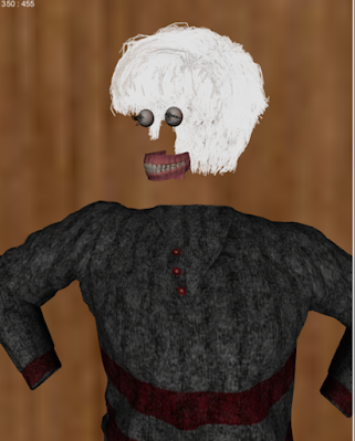
    7. One of the changes they made between the Genesis 8 and 9 character models was to make the eyes and teeth separate from the rest of the body. (I don't fully understand, but I think this makes it easier to change the shape of the head without making the eyes and teeth super wonky.)
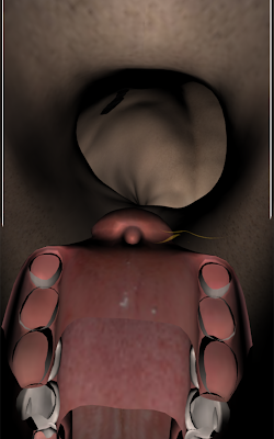
      So today I wanted to take the people out of the scene so I could just see the dog and I made the characters invisible. Except that leaves their clothes and hair visible (uh, okay) and in the Genesis 9 model, his eyes and teeth remain visible in some sort of horrible nightmarish view that I've put in the outtakes below.

    8. Mostly what I've learned this month is how easy it is to produce horrifying things.

    Outtakes

    "Tell me about your mother..."


    Saturday, February 4, 2023

    Webcomic: Day 4

     No. I still haven't worked out the lights. All I can say is... I had to bathe three ringworm-laden kittens who are getting really tired of this treatment today and that took all my energy. The expression on the last panel is ridiculous, but I'm not going to go back and fix it because it's funnier the way it is.


    Things I learned today

    1. I made Gary (the guy with white hair) from the Genesis 9 androgyne, instead of starting with the Genesis 8 male. There are a few other differences — notably the starting point of silver skin, and a lack of defined expressions — but I do like the Genesis 9 figure.

    2. I FOUND A PAIR OF PANTS!!!! (They are from a Genesis 2 "Newport" outfit, but they seem to be fine on the Genesis 9 figure.) And the outfit comes with shoes!

    3. While there are pre-set poses for the dog which have the head turned, I don't seem to be able to do that manually. I find this hard to believe. I'm probably missing something.

    4. Char is now wearing the "Rogue Lynx Outfit" which covers marginally more skin than the "Shadow Thief" outfit and the "String Bikini for Victoria 6". While I'm willing to believe the over-sexualization of female characters is from the usual causes, it may just be because adding more fabric causes a greater technical challenge for the different poses.

      Nah, just kidding, it's totally because they're trying to attract guys who never leave their basement.
    5. The one drawback of the Genesis 9 figure is the available poses. In every single one, the person is standing on their toes. These made me laugh.


    Outtake of the day

    Before I realized Gary's skin was really going to render that way. And also before I found him some pants and shoes.

    Friday, February 3, 2023

    Webcomic Day 3: Ian

     Okay, we're back to hilariously bad.

    Part 3: Ian


    Things I learned today

    1. Apparently, the default look of the Genesis 8 male is "douche-bro". It's the hair and the shorts (which are really boxers because he doesn't come with pants). I was totally tempted to change his name from Ian to Chad, but I didn't.

    2. The F-stop on the camera does absolutely nothing. I thought I could get around the lighting problem that way, but no.

    3. Dangit, I'm going to have to actually light scenes.

    4. I changed something in the render settings and broke the render, so I reset everything and now we're back to renders that take two hours for a dinky little underlit scene. Probably I should write down the things I change so I know what to change back, but where's the fun in that? I did learn that you can cancel a render and save what it's come up with so far, which seems useful.

    5. Yes, Ian here is walking around without shoes because there aren't any. Well, there are, but they are high heels, and though it's tempting to use them, I just can't see it.

    6. For poses, I can either use one of the five bizarre options available, or I can move joints individually and create my own impossible stances.

    7. Ooh, I added a little vase thing. Set dressing!

    8. The "save" and "close" buttons on the render panel are in the opposite order I think they should be in, and twice now I've spent half an hour rendering something only to accidentally close the window instead of saving the file. Sigh.

    9. The "Tonemapper" F-stop does work. I changed that from 12 to 2 and suddenly the scene has more light. I should probably still figure out the three stage-lights thing.

    10. I tried to change the color of the dog and somehow it turned it sort of blue, or else it was just reflecting the light oddly. Oops. But I was able to go back to the preset surfaces so at least I was able to fix it.

    Outtakes

    The blue dog:


    Today I also found out you can accidentally move the camera inside Chad's Ian's head and it was truly horrifying.


    Thursday, February 2, 2023

    Webcomic: Day 2

    All kinds of learning took place today, but I'll be honest and admit that 90% of the improvement had to do with making the ceiling visible. (I had made the ceiling invisible when I was trying to figure out where the person had ended up after I added her to the scene.) Why did that change the lighting so much? Apparently there's a fireball hovering overhead...?

    You might have to click to make it bigger.


    Things I learned today

    1. Canva has a comic template to make it easier to layout panels. I probably need to use something more vertical for the blog though.

    2. Lighting: adding the ceiling made a huge improvement, but now it's too dark. I need to actually use lights.

    3. Set dressing: The more renders I made of this giant empty building, the more I realized there's a reason people get paid to do set dressing. Tomorrow's scene takes place elsewhere, so I'll see if I can find some things to scatter around.

    4. Posing: The pose in the first panel makes me laugh. It's harder than you think!

    5. I figured out how to add something on the other side of the windows.

    Anyhow, this is enough of an improvement from yesterday that a whole different set of flaws is visible. Yay for progress!

    Wednesday, February 1, 2023

    Webcomic: Day 1

     Ha ha! I warned you this was going to be terrible, and it does not disappoint!

    Pretend the captions are actually on the image somewhere, and that everything is framed correctly. It took me so long to get any images at all that I didn't have time to set up the rest. Also, yes, I realize you can't actually see anything. I guess I'll figure that out tomorrow.


    (Narration: I'm Char, an animal mage employed by Blackthorn Protection Agency. I'm damned good at protecting my clients. Also, damned tired — I haven't had a day off in weeks. So naturally... <sound of ringing phone>)


    Voice on phone: Char, I need your help.
    Char: Not now, Gary. I've been watching that kid for three weeks. The next time he pulls my tail, I'm going to bite him, and then what —


    Voice on phone: Not that. This is for a friend. A rune mage.


    Voice on the phone: Someone's trying to kill him.


    Things I learned today

    1. DAZ Studio is supposed to be able to store files anywhere, but that may not be true. By default, it installs and stores everything on the iCloud drive. Then, of course, I ran out of storage space. And since I already pay for Dropbox, I didn't want to pay to increase my iCloud space. So I told it to store things elsewhere and things went wonky.
      I uninstalled and reinstalled a few times. It's currently still using the Dropbox drive, but it took a really long time to install some package that should have been quick, so I may just need to reinstall with the standard location.

    2. My computer is great for what I normally use it for (writing, web surfing, reading email, GIMP), but rendering is really taxing it. (For example, it's only 79% through the first render at 21 minutes.)

      Note to self: I need to stop streaming the kitten cam before rendering. Also, I can probably cut down on the work it's doing if I'm okay with the output not being as fine (which I am), but I'll have to figure out what settings to tweak.

      After the first render took 90 minutes, I dropped the pixel size from 700x900 to 350x455 and decreased some other random numbers. After that it only took a few minutes to get a terrible image similar to the first terrible image.

    3. I think I'm supposed to have some backdrop on the other side of the window in the scene. Oh well. Pretend there are curtains instead of an infinite void. But since I haven't figured out the lighting, you can't see it anyhow.

    4. You have no idea how long it took me to bend her elbow so I could pretend she was holding a phone. I think her hand is currently occupying the space in the middle of her head, but that fell into the "close enough" rule. Learning curve!

    5. I think I need to figure out what I'm doing that's making everything so washed out tomorrow. Lighting? Something else? Probably the lighting.

    The good news is that I've left significant room for improvement.