Short-form social media continued its dive into the trash pit of society this year. Twitter is basically just Nazis now, Facebook's algorithm has advanced to the point that I never see anything I've asked for, and everyone is excited about Bluesky but it's just another platform waiting for its billionaire owners to turn into a right-wing hellhole. I am on Mastodon, which is truly decentralized (unlike Bluesky, which is definitely not), and I like it there, but often I long for the days when everyone just had a blog.
For years, I have checked multiple blogs by having a browser tab with twenty blogs bookmarked and just... clicking on each one in turn whenever I remember to check. Sure, that works, but it's really inefficient, especially when some only update every three months (surely not me!) and at least one blog (cough, cough, jenfullmoon, I'm looking at you here!) takes three minutes to load because it has to time out on one of the css files.
The good news is that I'm an idiot and there has always been a way to handle this more elegantly. So this year, I finally looked into RSS readers. And because I know I'm probably not the only one who hadn't figured this out, here is some very basic info.
What is an RSS Reader?
The non-technical answer: It's a website that notices when a blog you follow has a new entry. So you only have to visit one website, instead of twenty.
There are many RSS readers. I use the free version at
inoreader.com.
How do I set it up?
After you create an account, you click on "Add Feed" to add each blog you want it to watch. And just like that, you have a feeds page that might look something like this:
Each square on the right has a blog post I haven't read yet. (Okay, that's not really true. I marked them unread so I could take this screenshot. Also, I haven't finished adding in all the Holidailies blogs, so they aren't all showing up here.)
Once you click on a post and read it, it disappears from the newsfeed, so you can always easily see what you haven't read. New blog posts just magically appear.
What else can you do with the RSS reader?
Honestly, I have no idea. But I think you can sort things into folders, which I could see being helpful if you only want to look at political blogs once a week or something like that.
Hey, isn't this sort of a generic version of the Holidailies page?
It really is, though of course we all love the
Holidailies page. But if the Holidailies folks ever get tired of maintaining the code, there may be a way to do something like set up a public folder on inoreader that would achieve a similar thing.
Thus ends the RSS reader lesson. Seriously, it's easy to set up. Go do it now!
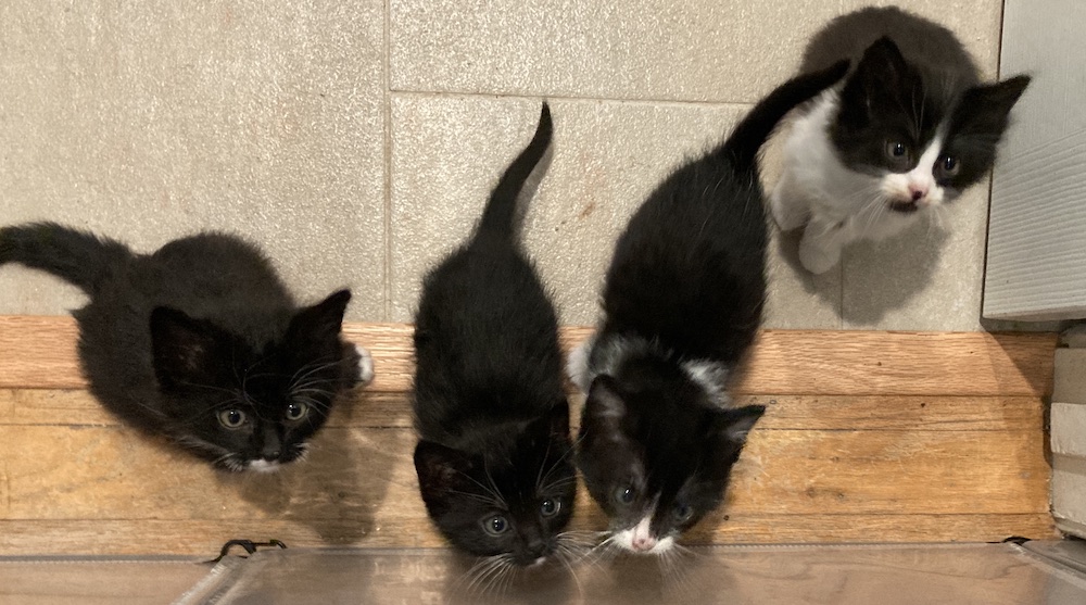
Kitten Watch 2024
Things continue to look promising. Two of the kittens are right around the minimum weight. The other two are on track to make it a few days before surgery. Fingers crossed their vaccine appointment tomorrow doesn't throw them off track.
(Kittens often have a day of not feeling great after getting vaccinated and dewormed. Worse, we've had a problem with kittens developing diarrhea right after they go in. I'm not sure why — the shelter staff always wear gloves when handling the kittens. Maybe it's just a stress thing.))
This is a naughty kitten (Giorgio Furmani) who escaped from the playpen this morning. He is the one whose whiskers are little nubbins, though it's less obvious in this picture. Apparently it is time for the kittens to move from my office to the (much harder to escape from) bathroom.
Have I reached my 1700 word goal today?
No, but it's not even noon. I reached my goal yesterday.

.jpg)


.png)

.png)

.png)

.png)
.png)


.png)
.png)

.png)


.png)


.png)

.png)


.png)


.jpg)


