No, this is not about machine learning (which isn't artificial intelligence, no matter what they keep calling it). This is more basic.
I turns out I know nothing about visual arts. The last time I learned anything was in kindergarten when they told us the primary colors were red, blue, and yellow, and then I became a programmer (uh, there were a few years in between) and found out they changed the rules and the primary colors are really red, blue, and green. My life has been a lie.
So mostly I do things in GIMP (because I'm too cheap to pay for Photoshop) and click on buttons and add layers and choose "colorize" and try every filter that exists and hope it all looks good. That either works or I give up and do something else.
But I know other people know what's going on and do these things with intention. So my question here is:
How do I make this look better?
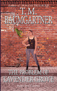
The final cover will look something like this:
I need to go back and darken the bottom of the image so the text stands out, but first I need to fix the disappearing dragon. And maybe other stuff...
The image is made from these three pictures I licensed from DepositPhotos: a brick wall, a person, and a vector dragon.
The dragon completely fades into the background.
I'm guessing I need to... desaturate the brick background before adding the person and the dragon? Is that the term I want?
If I can figure out the right terms, I can find a video on YouTube that will tell me how to fix this. I hope.


You are a much better designer than I am, and yet I don't mind tossing my limited knowledge your way. If desaturation isn't what you want, try reducing the opacity of the layer with the building. I'm not sure if the dragon layer will pop more if it's in front or behind the building layer.
ReplyDeleteOoh, decreasing the opacity of the layer and putting a solid color underneath it will cut down on the variation in the bricks and make the other color pop, I think. I've been messing with the saturation, but I'll try this one, too.
ReplyDelete