I had fully intended to start out this post by displaying book covers similar to what I am writing, because... the whole point of a cover is to tell people "if you like that, then you should try this". So if you can telegraph that your book is similar to another book, you can alert the right audience.
The problem is that I'm having a hard time coming up with the correct genre (which doesn't bode well for my ability to sell the thing, ugh). It's closest in tone to something like paranormal women's fiction or urban fantasy, but both those genres are overrun with werewolves and supernatural creatures and mine is pretty much science-based.
If I look at the books that are based in some science, everything is either post-apocalyptic or a thriller, which mine is definitely not.
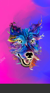
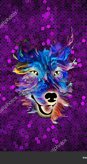
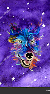
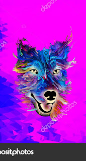
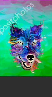
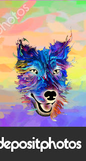
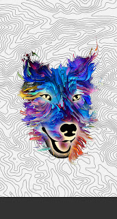
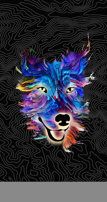
So... I'll keep looking. But in the meantime, I wanted to swap in some different backgrounds and see what happened. So I did. (If I decide to go with one of these, I'll license the image — for now I'm just throwing things at the wall to get an idea of where I should aim.)
(I threw out a bunch of others that were even worse.)
B&E fit with the dog head style the best. I was trying some topical map images on H&I to get the outdoorsy theme, but it wasn't quite working.
Then I inverted the colors on the last one and overlaid it on black with minimal opacity and got this.




Nice work! There’s nothing wrong with being the first to expand a genre in a new direction.
ReplyDeleteThanks! The problem is making it close enough to what's currently out there so it attracts the right audience. I'm just having a hard time pinning down that audience. If I were better about the business side of things, I would write something that fits better into existing categories. Oh well. [shrug]
ReplyDelete