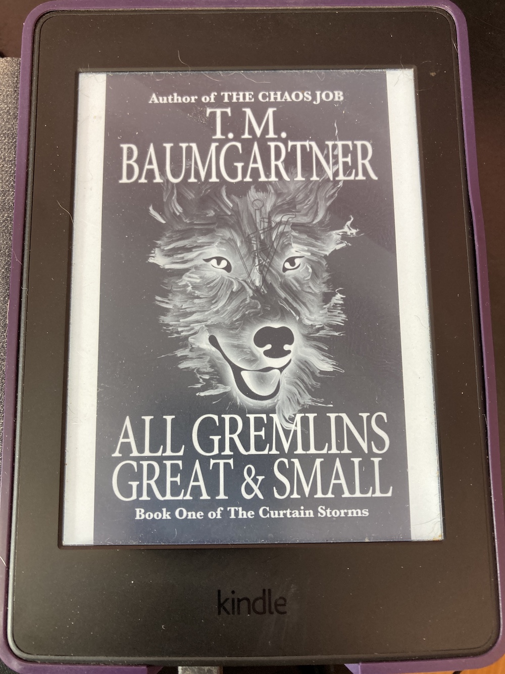
Last night I remembered one other check I wanted to make before continuing with the cover:
How does it look in black & white?
Some people read on their phones or browse for a book to buy on their computer, but other people look at things on e-readers, and many of those aren't in color.
My first thought was to just use Preview or GIMP or whatever to convert it to B&W. And it looked fine to me.
It's legible, the image stands out, and everything looks good. (Though I am having second thoughts about the size of the ampersand...)
But is that really how it would look on an e-reader? In order to test that, I made it a book (using Vellum, which is how I format all my books) and transferred that onto my Kindle.
(You'll have to ignore all the cat hair...)
The black isn't as dark there, but I still think it looks fine. Another hurdle cleared.
Tomorrow, the spine!


No comments:
Post a Comment