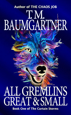
Remember a few days back when I was trying out different watermarked backgrounds and said "oh yeah, if I go with any of these I'll have to go back and purchase the files"?
I did that with the topography map and put the purchased version into the file and also made the whole image wider so I could potentially made the dog's head smaller. And of course, that whole process took a while. But here's a mostly unchanged version that has the purchased background. I also changed the font on my name.
I'm still not completely convinced about my font choices, but I think it's getting close. I need to fix a couple of small things (kerning between the initials and the periods, for one). And how does it look in thumbnail?
Still legible, so that's a win.
Tomorrow I'll see if shrinking the dog's head helps any — I suspect I'll like it better the way it is now, but it's worth the experiment.


This looks great!
ReplyDelete